Chart position — tracked daily by LaunchShots
Screenshot style breakdown
Sampled from 5 of 搭搭天气's App Store screenshots — background, accent and theme, measured by LaunchShots (not something Apple publishes).
#FCF4EC bg
#DDD6CF
#5CB4FC accent
#111111 text
Screenshots


Icon palette
About this app
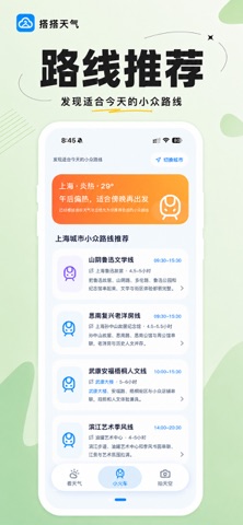
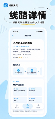
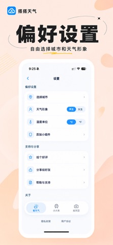
搭搭天气,是一个陪你更轻松出门的天气 App。 不只是告诉你今天几度,还会把天气变成更容易理解的出门建议:今天要不要带伞、适不适合出去走走、天气热不热、风大不大,让你不用研究一堆天气数据,也能快速知道今天该怎么安排。 【看天气】 · 查看当前天气、温度、最高 / 最低温 · 查看未来 24 小时天气变化 · 查看未来 10 日天气预报 · 提供今日出门建议 · 查看降雨、风速、UV 等出门相关信息 · 支持摄氏度 / 华氏度切换 · 支持桌面天气小组件 【小火车】 不知道今天去哪儿? 根据当前城市和天气状态,为你推荐更适合今天的小众路线。 · 查看当前已开放城市的小众路线 · 根据天气优先推荐更合适的路线 · 每条路线提供完整游览顺序 · 查看每一站的位置、建议停留时间、门票、开放时间和景点介绍 · 查看路线强度与完整行程 天气舒服时,可以去公园、散步或轻徒步; 下雨、炎热或寒冷时,则会优先推荐更适合当前天气的室内或轻量路线。 【拍天空】 把今天看到的天空留下来。 · 点击相机即可拍摄天空 · 也可以从系统相册选择照片 · 根据天空色彩生成渐变壁纸 ·…
App details
What you can learn from 搭搭天气
Every shipping app on the App Store has gone through the same decisions you're working through right now: which screenshot goes first, what caption sits over it, which device frame to show, what color the background should be. The 5 screenshots above are 搭搭天气's answers to those questions — they're public, they're real, and they made it through Apple's review.
What the numbers say: 搭搭天气 runs a light set with one background colour (#FCF4EC) carried across every screenshot — the listing reads as a single poster when the shots sit side by side in search results. The accent colour we picked up, #5CB4FC, is the one to reuse for badges, arrows and highlighted words if you borrow this look. Hit Use this style to open the editor with these exact colours and drop your own screenshot in.
Notice the first screenshot in particular. It's the one users see in search results and on the product page, and it's where most apps spend their best caption and tightest design. Look at the proportion of background to phone, where the text sits, what one thing the image is trying to communicate.
Want to see how other Weather apps approach the same problem? Browse more Weather apps in the showcase.
Take what works into your own screenshots
Open LaunchShots and design your App Store & Google Play screenshots — pick a device frame, drop captions, ship in minutes. Free, in your browser.
Open the screenshot editor →Apps with a similar look
Closest background + accent colours among the listings we've analysed — useful when you want to see the same palette handled by a different team.