Chart position — tracked daily by LaunchShots
Screenshot style breakdown
Sampled from 6 of LoHi - Đọc & Nghe Truyện's App Store screenshots — background, accent and theme, measured by LaunchShots (not something Apple publishes).
#040404 bg
#272727
#F40404 accent
#FFFFFF text
Screenshots
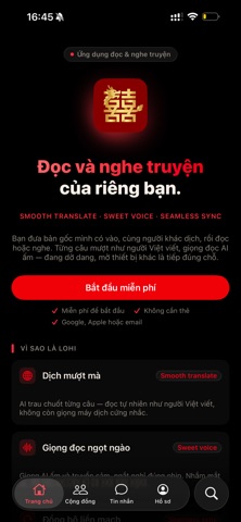
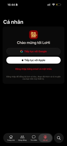

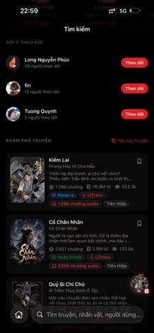


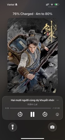


iPad screenshots


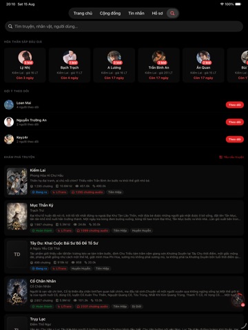

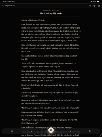
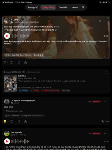

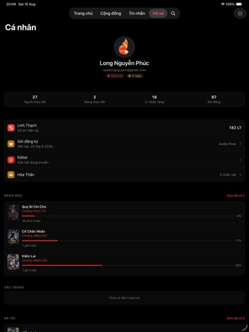

Icon palette
About this app
LoHi là ứng dụng đọc và nghe dành cho người Việt: một thư viện gọn gàng, một trình đọc êm mắt, một giọng đọc AI tự nhiên - và chỗ bạn đang đọc dở luôn đi theo bạn giữa iPhone, iPad và web. ĐỌC ÊM MẮT • Trình đọc tối giản, tự lưu vị trí từng chương và mở lại đúng chỗ. • Chỉnh cỡ chữ, giãn dòng và nền sáng/tối cho vừa mắt. • Hỗ trợ Dynamic Type và VoiceOver, vùng chạm tối thiểu 44pt. • Lưu chương về máy để đọc tiếp khi mất mạng. NGHE MỌI LÚC • Giọng đọc AI nghe tự nhiên, không phải giọng máy đọc từng chữ. • Phát nền: khoá màn hình, chuyển sang app khác, rút tai nghe — vẫn nghe tiếp. • Điều khiển ngay trên Màn hình khoá và Trung tâm điều khiển. • Chỉnh tốc độ đọc; bật nhạc nền nhẹ nếu bạn thích. TÌM ĐÚNG THỨ BẠN MUỐN • Tìm kiếm bỏ qua lỗi gõ và thiếu dấu — gõ "tien hiep" vẫn ra "tiên hiệp". • Trang khám phá theo thể loại, bảng xếp hạng và danh sách bạn đang theo dõi. CỘNG ĐỒNG • Đăng b…
App details
What you can learn from LoHi - Đọc & Nghe Truyện
Every shipping app on the App Store has gone through the same decisions you're working through right now: which screenshot goes first, what caption sits over it, which device frame to show, what color the background should be. The 20 screenshots above are LoHi - Đọc & Nghe Truyện's answers to those questions — they're public, they're real, and they made it through Apple's review.
What the numbers say: LoHi - Đọc & Nghe Truyện runs a dark set with one background colour (#040404) carried across every screenshot — the listing reads as a single poster when the shots sit side by side in search results. The accent colour we picked up, #F40404, is the one to reuse for badges, arrows and highlighted words if you borrow this look. Hit Use this style to open the editor with these exact colours and drop your own screenshot in.
Notice the first screenshot in particular. It's the one users see in search results and on the product page, and it's where most apps spend their best caption and tightest design. Look at the proportion of background to phone, where the text sits, what one thing the image is trying to communicate.
Want to see how other Book apps approach the same problem? Browse more Book apps in the showcase.
Take what works into your own screenshots
Open LaunchShots and design your App Store & Google Play screenshots — pick a device frame, drop captions, ship in minutes. Free, in your browser.
Open the screenshot editor →Apps with a similar look
Closest background + accent colours among the listings we've analysed — useful when you want to see the same palette handled by a different team.