Chart position — tracked daily by LaunchShots
Screenshot style breakdown
Sampled from 5 of Denk: Hiç karşılaştık mı?'s App Store screenshots — background, accent and theme, measured by LaunchShots (not something Apple publishes).
#D49C14 bg
#BA8911
#FCE49C accent
#111111 text
Screenshots



iPad screenshots


Icon palette
About this app
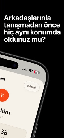
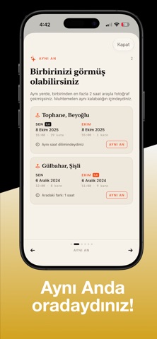
Bir arkadaşınızla, sevgilinizle ya da yeni tanıştığınız biriyle daha önce farkında olmadan aynı yerde bulunmuş olabilir misiniz? Denk, telefonunuzdaki fotoğrafların yanında zaten duran iki bilgiyi kullanır: nerede ve ne zaman çekildikleri. Bu bilgileri karşılıklı olarak birbirini ekleyen iki kişi arasında karşılaştırır ve yollarınızın geçmişte kaç kez kesiştiğini gösterir. DÖRT KADEME SONUÇ - Aynı an — Aynı yerde, en fazla iki saat arayla. Muhtemelen aynı kalabalığın içindeydiniz. - Aynı gün — Aynı yerdeydiniz ama farklı saatlerde. Belki siz çıkarken o geldi. - Aynı hafta — Birkaç gün arayla aynı semtte bulundunuz. - Aynı dönem — Aynı ay içinde aynı şehirdeydiniz. Kıl payı kaçırdıklarınızı da gösteririz. Bazen en güzel hikâye, iki saat farkla kaçırılmış olanıdır. FOTOĞRAFLARINIZ TELEFONUNUZDAN ÇIKMAZ Denk hiçbir fotoğrafınızı açmaz, görüntülemez, yüklemez veya saklamaz. Yalnızca i…
App details
What you can learn from Denk: Hiç karşılaştık mı?
Every shipping app on the App Store has gone through the same decisions you're working through right now: which screenshot goes first, what caption sits over it, which device frame to show, what color the background should be. The 9 screenshots above are Denk: Hiç karşılaştık mı?'s answers to those questions — they're public, they're real, and they made it through Apple's review.
What the numbers say: Denk: Hiç karşılaştık mı? runs a mixed light-and-dark set where the background shifts from screenshot to screenshot (first shot #D49C14) — each image has to stand on its own, so the captions carry more of the story. The accent colour we picked up, #FCE49C, is the one to reuse for badges, arrows and highlighted words if you borrow this look. Hit Use this style to open the editor with these exact colours and drop your own screenshot in.
Notice the first screenshot in particular. It's the one users see in search results and on the product page, and it's where most apps spend their best caption and tightest design. Look at the proportion of background to phone, where the text sits, what one thing the image is trying to communicate.
Want to see how other Social Networking apps approach the same problem? Browse more Social Networking apps in the showcase.
Take what works into your own screenshots
Open LaunchShots and design your App Store & Google Play screenshots — pick a device frame, drop captions, ship in minutes. Free, in your browser.
Open the screenshot editor →Apps with a similar look
Closest background + accent colours among the listings we've analysed — useful when you want to see the same palette handled by a different team.