Screenshot style breakdown
Sampled from 6 of SlripCnat: Pourchestra's App Store screenshots — background, accent and theme, measured by LaunchShots (not something Apple publishes).
#A40404 bg
#B02727
#E49494 accent
#FFFFFF text
Screenshots


iPad screenshots



Icon palette
About this app
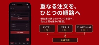
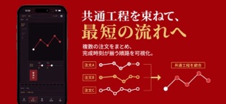
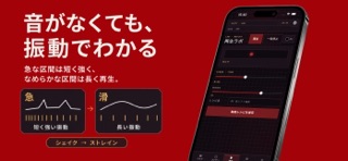
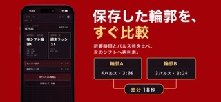
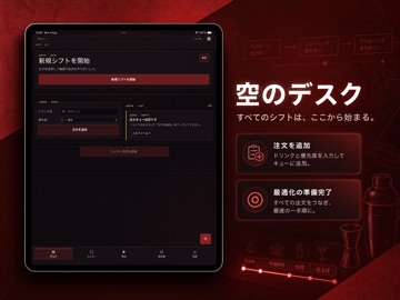
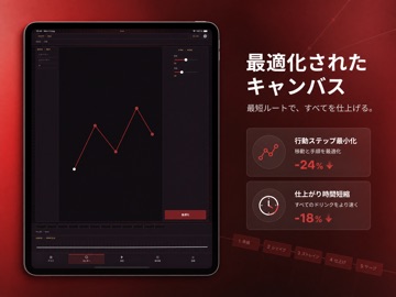
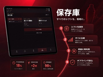
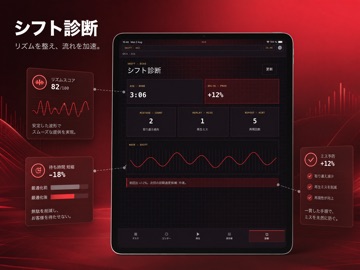
注文の重なりが増える夜ほど、どこから手を付けるべきかを一瞬で見失いがちです。 最初の1杯目を入れるときは、作業順を脳内で追うだけで十分に見えます。2杯目、3杯目が重なると、そのやり方は曖昧になります。SlripCnat: Pourchestraはドリンクを1本の輪郭として描き、共通材料の工程を束ねた再生順を地図のように可視化するので、今の一手と次の一手の距離が短くなります。 曲線が急になる区間は短く強い振動で、なめらかな区間は長い振動で再生されます。音を出せない場面でも、握り心地だけで「これからシェイク」「次はストレイン」などのリズムを確認できるため、見本に頼らず体で判断できます。 完成時刻を揃えるために同じ順路を保存し、次回シフトで呼び出すと比較がすぐできます。保存済み輪郭は誰の情報にも依存せず、あなたの店の実地感覚に合わせて育てられるローカルな作業記録として使い続けられます。
App details
What you can learn from SlripCnat: Pourchestra
Every shipping app on the App Store has gone through the same decisions you're working through right now: which screenshot goes first, what caption sits over it, which device frame to show, what color the background should be. The 14 screenshots above are SlripCnat: Pourchestra's answers to those questions — they're public, they're real, and they made it through Apple's review.
What the numbers say: SlripCnat: Pourchestra runs a dark set with one background colour (#A40404) carried across every screenshot — the listing reads as a single poster when the shots sit side by side in search results. The accent colour we picked up, #E49494, is the one to reuse for badges, arrows and highlighted words if you borrow this look. Hit Use this style to open the editor with these exact colours and drop your own screenshot in.
Notice the first screenshot in particular. It's the one users see in search results and on the product page, and it's where most apps spend their best caption and tightest design. Look at the proportion of background to phone, where the text sits, what one thing the image is trying to communicate.
Want to see how other Food & Drink apps approach the same problem? Browse more Food & Drink apps in the showcase.
Take what works into your own screenshots
Open LaunchShots and design your App Store & Google Play screenshots — pick a device frame, drop captions, ship in minutes. Free, in your browser.
Open the screenshot editor →Apps with a similar look
Closest background + accent colours among the listings we've analysed — useful when you want to see the same palette handled by a different team.