Chart position — tracked daily by LaunchShots
Screenshot style breakdown
Sampled from 3 of Bé Ngủ Ngon - Trợ lý giấc ngủ's App Store screenshots — background, accent and theme, measured by LaunchShots (not something Apple publishes).
#FCFCFC bg
#DDDDDD
#745434 accent
#111111 text
Reading the caption text from the screenshots in your browser…
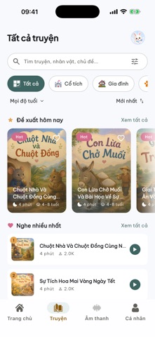
Screenshots


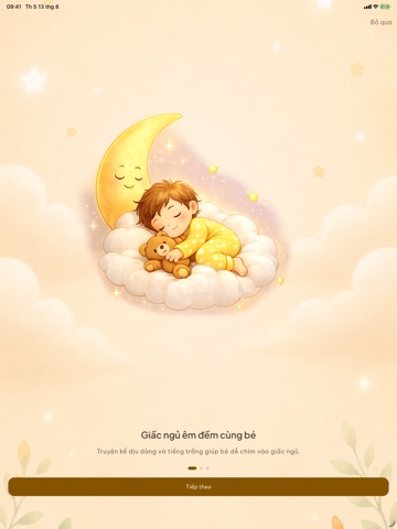
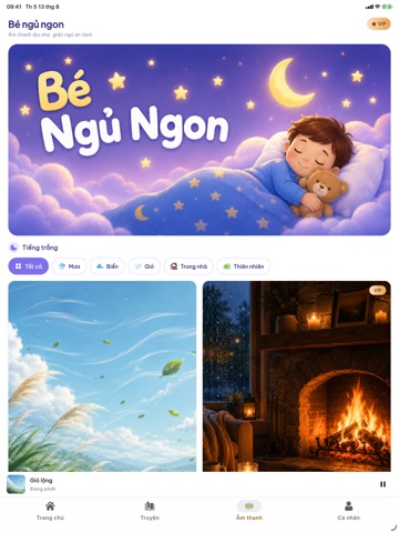
iPad screenshots




Icon palette
About this app
Bé Ngủ Ngon là ứng dụng dành cho phụ huynh giúp bé yêu thư giãn trước giờ ngủ mỗi đêm, với kho truyện kể ấm áp và âm thanh ru ngủ dịu êm được tuyển chọn kỹ lưỡng. KHO TRUYỆN KỂ PHONG PHÚ Hàng chục câu chuyện cổ tích và truyện ru ngủ được kể bằng giọng đọc nhẹ nhàng, phù hợp theo từng nhóm tuổi của bé. Mỗi tối là một câu chuyện mới, giúp bé vừa thư giãn vừa nuôi dưỡng trí tưởng tượng. ÂM THANH RU NGỦ Bộ sưu tập âm thanh thiên nhiên tạo không gian thư giãn trước giờ ngủ như tiếng mưa rơi, sóng biển, lò sưởi tí tách, gió thổi và tiếng quạt máy đều đều. Có thể hẹn giờ tắt tự động để thuận tiện sử dụng vào buổi tối. HỒ SƠ RIÊNG CHO TỪNG BÉ Tạo hồ sơ riêng với tên, nhóm tuổi và avatar để ứng dụng gợi ý nội dung phù hợp với bé. YÊU THÍCH VÀ TIẾP TỤC NGHE Lưu lại những câu chuyện yêu thích và tự động ghi nhớ tiến trình nghe, giúp phụ huynh dễ dàng tiếp tục nội dung vào lần sử dụng sau. …
App details
What you can learn from Bé Ngủ Ngon - Trợ lý giấc ngủ
Every shipping app on the App Store has gone through the same decisions you're working through right now: which screenshot goes first, what caption sits over it, which device frame to show, what color the background should be. The 13 screenshots above are Bé Ngủ Ngon - Trợ lý giấc ngủ's answers to those questions — they're public, they're real, and they made it through Apple's review.
What the numbers say: Bé Ngủ Ngon - Trợ lý giấc ngủ runs a light set with one background colour (#FCFCFC) carried across every screenshot — the listing reads as a single poster when the shots sit side by side in search results. The accent colour we picked up, #745434, is the one to reuse for badges, arrows and highlighted words if you borrow this look. Hit Use this style to open the editor with these exact colours and drop your own screenshot in.
Notice the first screenshot in particular. It's the one users see in search results and on the product page, and it's where most apps spend their best caption and tightest design. Look at the proportion of background to phone, where the text sits, what one thing the image is trying to communicate.
Want to see how other Book apps approach the same problem? Browse more Book apps in the showcase.
Take what works into your own screenshots
Open LaunchShots and design your App Store & Google Play screenshots — pick a device frame, drop captions, ship in minutes. Free, in your browser.
Open the screenshot editor →Apps with a similar look
Closest background + accent colours among the listings we've analysed — useful when you want to see the same palette handled by a different team.