Chart position — tracked daily by LaunchShots
Screenshot style breakdown
Sampled from 6 of YooNee! สจล. อยู่นี่!'s App Store screenshots — background, accent and theme, measured by LaunchShots (not something Apple publishes).
#F4F4F4 bg
#D6D6D6
#2C94FC accent
#111111 text
Screenshots





Icon palette
About this app
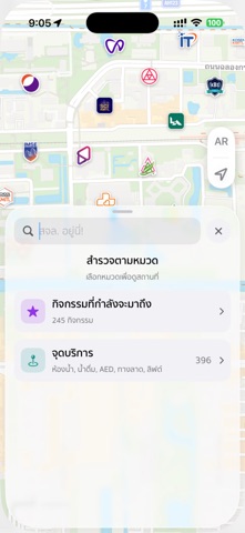
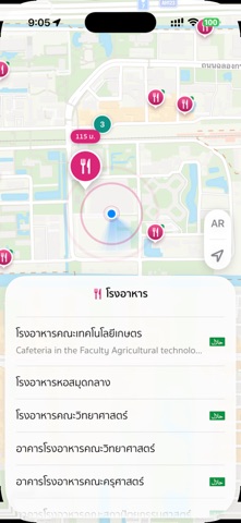
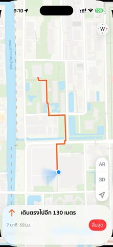
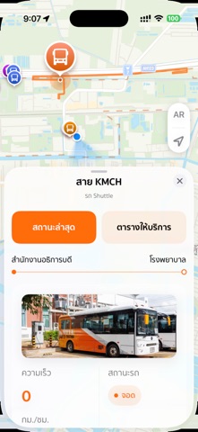
**YooNee!** คือเครื่องมืออัจฉริยะสำหรับแนะนำสถานที่และเส้นทางภายใน สจล. ที่ช่วยให้รู้ว่าสถานที่ สิ่งอำนวยความสะดวก ตลอดจนกิจกรรมต่าง ๆ อยู่ตรงไหน ไปทางไหน และมีอะไรน่าสนใจอยู่ใกล้ตัว ด้วยรูปแบบการเดินทางที่เป็นมิตรต่อผู้คนและสิ่งแวดล้อม ทั้งการเดินเท้า จักรยาน รถ EV Shuttle ไปจนถึงการเชื่อมต่อกับระบบขนส่งมวลชนภายนอก เช่น รถโดยสารสาธารณะ, เรือโดยสารไฟฟ้าที่ให้บริการในชุมชน ค้นหาอาคาร กิจกรรม และจุดบริการต่าง ๆ ได้ง่าย พร้อมเส้นทางที่คำนวณจากทางเดินจริง บอกระยะทาง เวลาเดิน และเส้นทางแบบทีละขั้น ระหว่างทางสามารถดูภาพจุดสังเกตและทางเข้าสถานที่ รวมถึงค้นหา โรงอาหาร จุดน้ำดื่ม AED ห้องน้ำ ทางลาด ลิฟต์ ที่จอดรถ ห้องละหมาด และจุดบริการสำคัญใกล้ตัว YooNee! ยังรองรับการติดตามตำแหน่งรถ EV Shuttle แบบเรียลไทม์ ภาพการจราจรบนถนน โหมด AR สำหรับดูชื่อสถานที่ตามทิศจริง และโหมดสำรวจสำหรับทดลองใช้งานได้จากทุกที่ แอปรองรับภาษาไทยและอังกฤษ โดยใช้ตำแหน่งเฉพาะขณะเปิดแอปเพื่อแสดงตำแหน่งและคำนวณเส้นทาง ไม่ต…
App details
What you can learn from YooNee! สจล. อยู่นี่!
Every shipping app on the App Store has gone through the same decisions you're working through right now: which screenshot goes first, what caption sits over it, which device frame to show, what color the background should be. The 9 screenshots above are YooNee! สจล. อยู่นี่!'s answers to those questions — they're public, they're real, and they made it through Apple's review.
What the numbers say: YooNee! สจล. อยู่นี่! runs a light set with one background colour (#F4F4F4) carried across every screenshot — the listing reads as a single poster when the shots sit side by side in search results. The accent colour we picked up, #2C94FC, is the one to reuse for badges, arrows and highlighted words if you borrow this look. Hit Use this style to open the editor with these exact colours and drop your own screenshot in.
Notice the first screenshot in particular. It's the one users see in search results and on the product page, and it's where most apps spend their best caption and tightest design. Look at the proportion of background to phone, where the text sits, what one thing the image is trying to communicate.
Want to see how other Navigation apps approach the same problem? Browse more Navigation apps in the showcase.
Take what works into your own screenshots
Open LaunchShots and design your App Store & Google Play screenshots — pick a device frame, drop captions, ship in minutes. Free, in your browser.
Open the screenshot editor →Apps with a similar look
Closest background + accent colours among the listings we've analysed — useful when you want to see the same palette handled by a different team.