Chart position — tracked daily by LaunchShots
Screenshot style breakdown
Sampled from 3 of NovaNews's App Store screenshots — background, accent and theme, measured by LaunchShots (not something Apple publishes).
#0C1414 bg
#2E3434
#0C5CBC accent
#FFFFFF text
Reading the caption text from the screenshots in your browser…
Screenshots


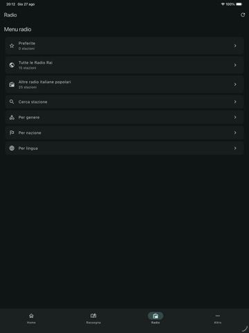
iPad screenshots


Icon palette
About this app
NovaNews raccoglie in un’unica app informazione, podcast, radio, sport e numerosi servizi utili per la vita quotidiana. è stata pensata per le persone con disabilità visiva, per fornire loro uno strumento rapido e senza alcun genere di pubblicità, per portare informazione, intrattenimento e strumenti utili ad un pubblico sempre più ampio. Segui i feed dalle principali fonti italiane e internazionali, crea la tua rassegna personale e aggiungi le fonti che preferisci. Cerca e segui i tuoi podcast preferiti e ascolta facilmente nuovi episodi. Radio e TV possono essere aggiunte inserendo manualmente l’indirizzo dello stream oppure sincronizzando NovaNews con la versione desktop, per ritrovare sul dispositivo mobile le tue stazioni e i tuoi canali preferiti. La sezione Sport permette di seguire risultati, eventi, competizioni e cronache testuali in diretta di calcio, tennis, basket e altre …
App details
What you can learn from NovaNews
Every shipping app on the App Store has gone through the same decisions you're working through right now: which screenshot goes first, what caption sits over it, which device frame to show, what color the background should be. The 7 screenshots above are NovaNews's answers to those questions — they're public, they're real, and they made it through Apple's review.
What the numbers say: NovaNews runs a dark set with one background colour (#0C1414) carried across every screenshot — the listing reads as a single poster when the shots sit side by side in search results. The accent colour we picked up, #0C5CBC, is the one to reuse for badges, arrows and highlighted words if you borrow this look. Hit Use this style to open the editor with these exact colours and drop your own screenshot in.
Notice the first screenshot in particular. It's the one users see in search results and on the product page, and it's where most apps spend their best caption and tightest design. Look at the proportion of background to phone, where the text sits, what one thing the image is trying to communicate.
Want to see how other News apps approach the same problem? Browse more News apps in the showcase.
Take what works into your own screenshots
Open LaunchShots and design your App Store & Google Play screenshots — pick a device frame, drop captions, ship in minutes. Free, in your browser.
Open the screenshot editor →Apps with a similar look
Closest background + accent colours among the listings we've analysed — useful when you want to see the same palette handled by a different team.