Chart position — tracked daily by LaunchShots
Screenshot style breakdown
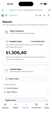
Sampled from 3 of Hizir Paket's App Store screenshots — background, accent and theme, measured by LaunchShots (not something Apple publishes).
#FCFCFC bg
#DDDDDD
#2C74DC accent
#111111 text
Screenshots


Icon palette
About this app
Hızır Paket Kurye, serbest çalışan kuryelerin kolayca iş bulabileceği ve kendi bölgelerinde teslimat görevleri alabileceği yenilikçi bir mobil uygulamadır. Esnek çalışma saatleri, kullanıcı dostu arayüz ve anlık bildirimlerle en yakın teslimatları kaçırmadan yakalayın. Öne Çıkan Özellikler: Kayıt işlemlerini hızlıca tamamlayın, dakikalar içinde kurye olun Size en yakın teslimat işlerini listeleyin Tek dokunuşla teslimat görevini kabul edin ve işe başlayın Tamamladığınız her görev için anında kazanç elde edin Günlük, haftalık ve aylık kazanç raporlarını uygulama içinden takip edin Canlı destek ve güvenli sistem altyapısı ile sorunsuz kurye deneyimi Hızır Paket Kurye ile kontrol sizde! Teslimat alanında serbest çalışmak, kendi zamanınızı yönetmek ve ek gelir elde etmek hiç bu kadar kolay olmamıştı. Hemen indirin, kaydınızı oluşturun ve teslimat işlerine başlayarak kazanmaya başla…
App details
What you can learn from Hizir Paket
Every shipping app on the App Store has gone through the same decisions you're working through right now: which screenshot goes first, what caption sits over it, which device frame to show, what color the background should be. The 3 screenshots above are Hizir Paket's answers to those questions — they're public, they're real, and they made it through Apple's review.
What the numbers say: Hizir Paket runs a light set with one background colour (#FCFCFC) carried across every screenshot — the listing reads as a single poster when the shots sit side by side in search results. The accent colour we picked up, #2C74DC, is the one to reuse for badges, arrows and highlighted words if you borrow this look. Hit Use this style to open the editor with these exact colours and drop your own screenshot in.
Notice the first screenshot in particular. It's the one users see in search results and on the product page, and it's where most apps spend their best caption and tightest design. Look at the proportion of background to phone, where the text sits, what one thing the image is trying to communicate.
Want to see how other Food & Drink apps approach the same problem? Browse more Food & Drink apps in the showcase.
Take what works into your own screenshots
Open LaunchShots and design your App Store & Google Play screenshots — pick a device frame, drop captions, ship in minutes. Free, in your browser.
Open the screenshot editor →Apps with a similar look
Closest background + accent colours among the listings we've analysed — useful when you want to see the same palette handled by a different team.