Chart position — tracked daily by LaunchShots
Screenshot style breakdown
Sampled from 6 of Miqo: Микрообучение и факты's App Store screenshots — background, accent and theme, measured by LaunchShots (not something Apple publishes).
#341C84 bg
#503B95
#6C4C24 accent
#FFFFFF text
Reading the caption text from the screenshots in your browser…
Screenshots
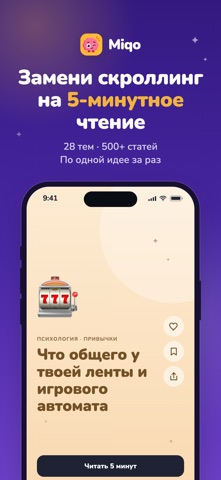
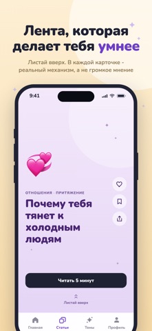


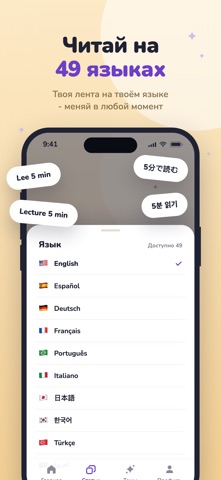
iPad screenshots


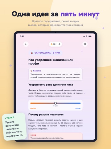


Icon palette
About this app
Пяти свободных минут хватает, чтобы узнать то, что останется с тобой. Miqo - лента коротких статей о том, как всё устроено на самом деле. Листай, остановись на карточке, которая зацепила, прочитай за пять минут, ответь на два вопроса. Готово, пока стынет кофе. ЭТО НЕ ПЕРЕСКАЗЫ КНИГ И НЕ КУРС Каждая статья объясняет один механизм обычными словами: почему мы прокрастинируем, почему в Средневековье спали дважды за ночь, что делает мозг в два часа ночи, почему тянет к холодным людям. Одна идея и один вывод, который можно применить сегодня. 28 ТЕМ, 282 ПОЛКИ Психология, нейронаука, отношения, память, сны, страхи, работа и выгорание, психология денег, история, тёмная история, криминал, мифология, философия, искусство, наука, космос, гены, долголетие, география, животные, катастрофы, мифы против правды. Выбирай полки, которые интересны, и лента подстроится. ТЕСТ ПОСЛЕ КАЖДОЙ СТАТЬИ Два кор…
App details
What you can learn from Miqo: Микрообучение и факты
Every shipping app on the App Store has gone through the same decisions you're working through right now: which screenshot goes first, what caption sits over it, which device frame to show, what color the background should be. The 14 screenshots above are Miqo: Микрообучение и факты's answers to those questions — they're public, they're real, and they made it through Apple's review.
What the numbers say: Miqo: Микрообучение и факты runs a mixed light-and-dark set where the background shifts from screenshot to screenshot (first shot #341C84) — each image has to stand on its own, so the captions carry more of the story. The accent colour we picked up, #6C4C24, is the one to reuse for badges, arrows and highlighted words if you borrow this look. Hit Use this style to open the editor with these exact colours and drop your own screenshot in.
Notice the first screenshot in particular. It's the one users see in search results and on the product page, and it's where most apps spend their best caption and tightest design. Look at the proportion of background to phone, where the text sits, what one thing the image is trying to communicate.
Want to see how other Education apps approach the same problem? Browse more Education apps in the showcase.
Take what works into your own screenshots
Open LaunchShots and design your App Store & Google Play screenshots — pick a device frame, drop captions, ship in minutes. Free, in your browser.
Open the screenshot editor →Apps with a similar look
Closest background + accent colours among the listings we've analysed — useful when you want to see the same palette handled by a different team.