Chart position — tracked daily by LaunchShots
Screenshot style breakdown
Sampled from 5 of isalo - 映画記録アプリ's App Store screenshots — background, accent and theme, measured by LaunchShots (not something Apple publishes).
#2C6C64 bg
#498079
#DCAC34 accent
#FFFFFF text
Screenshots


Icon palette
About this app
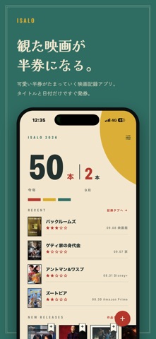
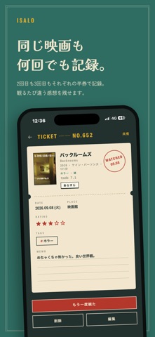
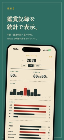
観た映画を「ヴィンテージ映画半券」として記録する映画記録アプリ。1本の映画を1枚の半券として登録し、鑑賞本数・評価・鑑賞場所を管理・振り返りできます。 ■ 半券として記録 ・映画1本を1枚の半券として登録 ・WATCHEDスタンプ付きの半券デザイン(ミッドセンチュリー・ヴィンテージ調) ・タイトル・評価(星5段階)・鑑賞日・鑑賞場所・メモを記録 ■ カレンダーで表示・管理 ・観た映画をカレンダー上に表示(月ごとの鑑賞ペースがひと目で分かる) ・「見たい映画」も鑑賞予定日を設定してカレンダーに表示(観た記録と色分け) ・日付をタップして、その日の記録・見たい作品を一覧 ・リスト表示/グリッド表示にも切り替え可能 ■ 複数回の鑑賞に対応 ・同じ作品を観るたびに半券を追加 ・「何回目の鑑賞か」を記録 ・鑑賞ごとに評価・メモを個別に保存 ■ ハッシュタグで整理 ・「#お気に入り」「#劇場」など自由なタグで分類 ・同じタグの作品をまとめて表示 ■ 統計で可視化 ・年間/今月の鑑賞本数を集計 ・星評価・鑑賞場所・ジャンル・制作国などの…
App details
What you can learn from isalo - 映画記録アプリ
Every shipping app on the App Store has gone through the same decisions you're working through right now: which screenshot goes first, what caption sits over it, which device frame to show, what color the background should be. The 5 screenshots above are isalo - 映画記録アプリ's answers to those questions — they're public, they're real, and they made it through Apple's review.
What the numbers say: isalo - 映画記録アプリ runs a dark set with one background colour (#2C6C64) carried across every screenshot — the listing reads as a single poster when the shots sit side by side in search results. The accent colour we picked up, #DCAC34, is the one to reuse for badges, arrows and highlighted words if you borrow this look. Hit Use this style to open the editor with these exact colours and drop your own screenshot in.
Notice the first screenshot in particular. It's the one users see in search results and on the product page, and it's where most apps spend their best caption and tightest design. Look at the proportion of background to phone, where the text sits, what one thing the image is trying to communicate.
Want to see how other Entertainment apps approach the same problem? Browse more Entertainment apps in the showcase.
Take what works into your own screenshots
Open LaunchShots and design your App Store & Google Play screenshots — pick a device frame, drop captions, ship in minutes. Free, in your browser.
Open the screenshot editor →Apps with a similar look
Closest background + accent colours among the listings we've analysed — useful when you want to see the same palette handled by a different team.