Chart position — tracked daily by LaunchShots
Screenshot style breakdown
Sampled from 6 of Wiggle Together's App Store screenshots — background, accent and theme, measured by LaunchShots (not something Apple publishes).
#0C0C0C bg
#2E2E2E
#6C4C34 accent
#FFFFFF text
Screenshots



Icon palette
About this app
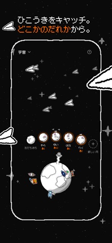
いっしょにらくがき。ぜんぶがくねくね動く。 らくがきを描いて、紙ひこうきに折って、飛ばそう。行き先は、友だちといっしょの月か、宇宙のかなた。宇宙では、どこかのだれかがキャッチして色をぬってくれるよ。 あなたと大切な人のための月。 友だちひとりと、ふたりだけの月をつくろう。親友でも、恋人でも、時差のある遠くのあの人でも。らくがきを送りあって、ふたりの月にどんどんたまっていくのを見守ろう。 80種類以上のマーカー。どれもたいくつじゃない。 単色、ストライプ、水玉、ぷっくり、木目、迷彩、銀河、にじ、タイダイ、カラースプレー、ラメ。 あなたの惑星。あなたのチューブさん。 宇宙から来たらくがきに色をぬると、あなただけの小さな惑星に引っ越してくるよ。歩いたり、はねたり、うかんだり、まわったり。てっぺんでは、チューブさんが手をふっているよ。 ほっとできる場所。らくがきは無料。 • フィードなし、いいねなし、フォロワー数なし • 月はプライベート:あなたと友だちだけ。チャットはなし、らくがきだけ • 何を描くか迷った…
App details
What you can learn from Wiggle Together
Every shipping app on the App Store has gone through the same decisions you're working through right now: which screenshot goes first, what caption sits over it, which device frame to show, what color the background should be. The 6 screenshots above are Wiggle Together's answers to those questions — they're public, they're real, and they made it through Apple's review.
What the numbers say: Wiggle Together runs a dark set with one background colour (#0C0C0C) carried across every screenshot — the listing reads as a single poster when the shots sit side by side in search results. The accent colour we picked up, #6C4C34, is the one to reuse for badges, arrows and highlighted words if you borrow this look. Hit Use this style to open the editor with these exact colours and drop your own screenshot in.
Notice the first screenshot in particular. It's the one users see in search results and on the product page, and it's where most apps spend their best caption and tightest design. Look at the proportion of background to phone, where the text sits, what one thing the image is trying to communicate.
Want to see how other Graphics & Design apps approach the same problem? Browse more Graphics & Design apps in the showcase.
Take what works into your own screenshots
Open LaunchShots and design your App Store & Google Play screenshots — pick a device frame, drop captions, ship in minutes. Free, in your browser.
Open the screenshot editor →Apps with a similar look
Closest background + accent colours among the listings we've analysed — useful when you want to see the same palette handled by a different team.