Chart position — tracked daily by LaunchShots
Screenshot changes — detected by LaunchShots
Screenshot style breakdown
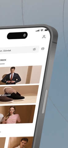
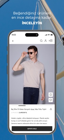
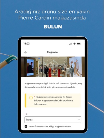
Sampled from 6 of Pierre Cardin Online Alışveriş's App Store screenshots — background, accent and theme, measured by LaunchShots (not something Apple publishes).
#A4A4AC bg
#909097
#643C1C accent
#111111 text
Screenshots




iPad screenshots


Icon palette
About this app
Pierre Cardin'in yenilenen kadın ve erkek koleksiyonlarını uygulamamızda keşfedin. Hayatın her alanında fark edilir bir şıklığı olan, kendinden emin kadın ve erkeklerin moda konusundaki yol göstericisi Pierre Cardin'in mobil uygulaması ile gündüzden geceye tüm okazyonlara uygun parçaları nerede olursanız olun inceleyebilir, özgün stilinizi kolayca oluşturabilirsiniz. Spor ayakkabı, çanta, kemer, bot gibi tamamlayıcı aksesuarlarla stilinizi güçlendirebilir, sweatshirt ve tişört gibi rahat giyim parçalarıyla günlük şıklığınızı oluşturabilirsiniz. Polo yaka tişörtler ve kumaş pantolonlar ise hem iş hem de sosyal hayatınızda modern bir görünüm sağlar. Damatlık ve smokin gibi özel anlar için tasarlanmış klasik parçalarla zarafetinizi vurgulayabilir, ceket ve mont seçenekleriyle soğuk havalarda da şıklığınızdan ödün vermeyebilirsiniz. Pierre Cardin App'te sizi neler bekliyor? • Kişiselleşt…
App details
What you can learn from Pierre Cardin Online Alışveriş
Every shipping app on the App Store has gone through the same decisions you're working through right now: which screenshot goes first, what caption sits over it, which device frame to show, what color the background should be. The 12 screenshots above are Pierre Cardin Online Alışveriş's answers to those questions — they're public, they're real, and they made it through Apple's review.
What the numbers say: Pierre Cardin Online Alışveriş runs a mixed light-and-dark set where the background shifts from screenshot to screenshot (first shot #A4A4AC) — each image has to stand on its own, so the captions carry more of the story. The accent colour we picked up, #643C1C, is the one to reuse for badges, arrows and highlighted words if you borrow this look. Hit Use this style to open the editor with these exact colours and drop your own screenshot in.
Notice the first screenshot in particular. It's the one users see in search results and on the product page, and it's where most apps spend their best caption and tightest design. Look at the proportion of background to phone, where the text sits, what one thing the image is trying to communicate.
Want to see how other Shopping apps approach the same problem? Browse more Shopping apps in the showcase.
Take what works into your own screenshots
Open LaunchShots and design your App Store & Google Play screenshots — pick a device frame, drop captions, ship in minutes. Free, in your browser.
Open the screenshot editor →Apps with a similar look
Closest background + accent colours among the listings we've analysed — useful when you want to see the same palette handled by a different team.