Screenshot style breakdown
Sampled from 4 of Waaaaay!(うぇーい)'s App Store screenshots — background, accent and theme, measured by LaunchShots (not something Apple publishes).
#14C4B4 bg
#11AC9E
#147CEC accent
#111111 text
Screenshots


iPad screenshots

Icon palette
About this app
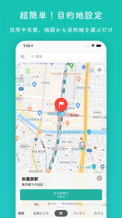
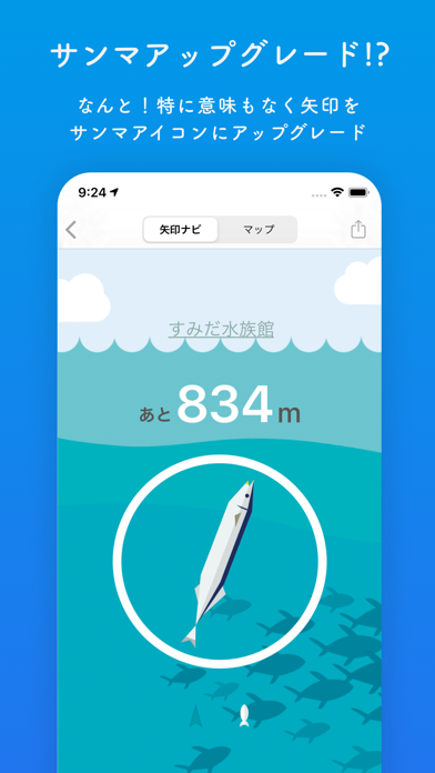
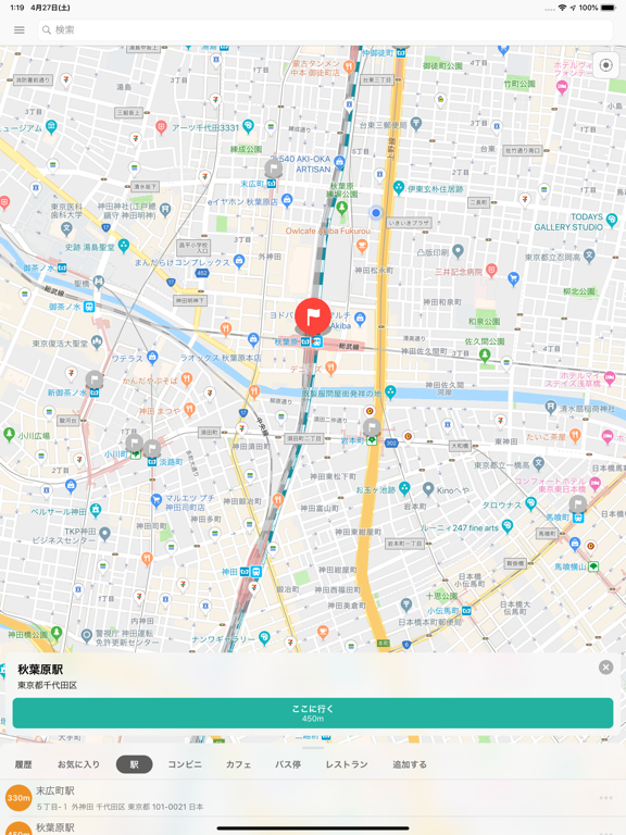
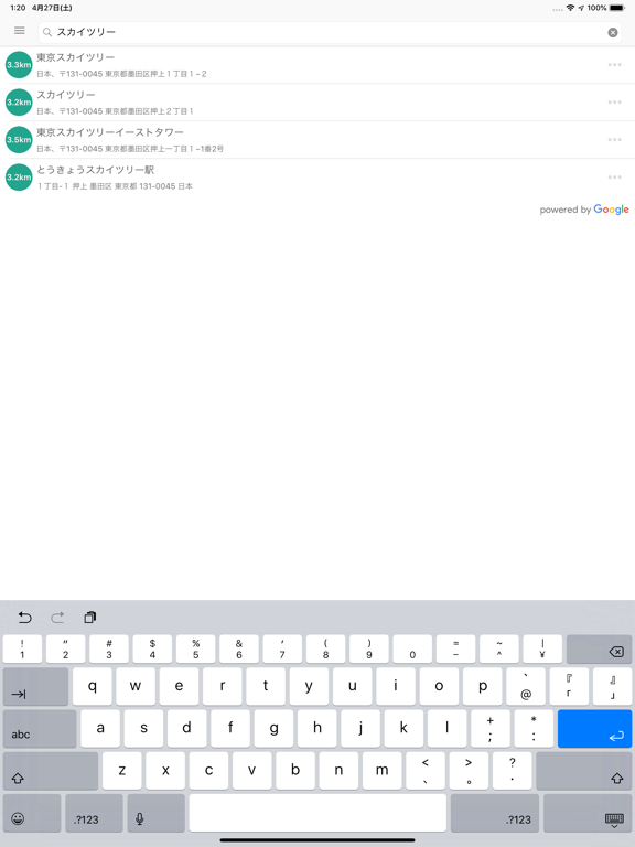
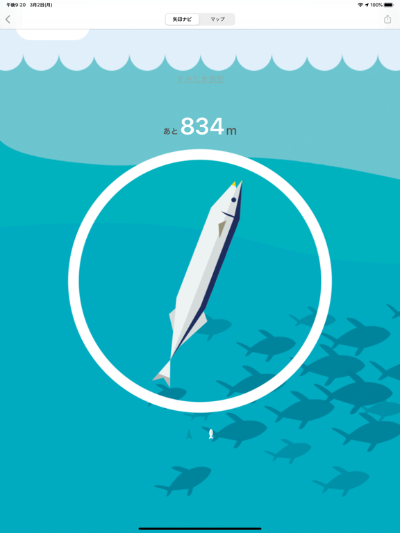
地図、読めますか? 私は読めません。 Waaaaay!(うぇーい)は、そんな方向音痴のための超シンプルなナビアプリです。 表示されるのは「目的地の方向」と「残りの距離」だけ。矢印の指す方へ歩けば、いつかは着きます。地図を読む必要はありません。 ■ こんな人におすすめ ・地図アプリを開いたまま、まずどっちに歩き出せばいいか分からない ・「北東へ進んでください」と言われても北東が分からない ・待ち合わせ場所の駅から出た瞬間に迷子になる ■ 使い方は3ステップ 1. 行きたい場所を検索(駅・コンビニ・カフェはワンタッチ検索) 2. 矢印が目的地の方向を指します 3. 矢印の方へ歩く。以上! ■ 機能 ・方向と距離だけの矢印ナビ(コンパスモード) ・地図で現在地と目的地を確認(地図モード) ・場所の検索、検索履歴、お気に入り ・他のアプリでコピーした場所のURLから目的地を設定 ・ロック画面に残り距離を表示(Live Activity) ・矢印をサンマに変えられる謎のアップグレード(なんで?) ■ 注意 ・GPSの特性上、屋内では位置がズレることがあり…
App details
What you can learn from Waaaaay!(うぇーい)
Every shipping app on the App Store has gone through the same decisions you're working through right now: which screenshot goes first, what caption sits over it, which device frame to show, what color the background should be. The 8 screenshots above are Waaaaay!(うぇーい)'s answers to those questions — they're public, they're real, and they made it through Apple's review.
What the numbers say: Waaaaay!(うぇーい) runs a mixed light-and-dark set where the background shifts from screenshot to screenshot (first shot #14C4B4) — each image has to stand on its own, so the captions carry more of the story. The accent colour we picked up, #147CEC, is the one to reuse for badges, arrows and highlighted words if you borrow this look. Hit Use this style to open the editor with these exact colours and drop your own screenshot in.
Notice the first screenshot in particular. It's the one users see in search results and on the product page, and it's where most apps spend their best caption and tightest design. Look at the proportion of background to phone, where the text sits, what one thing the image is trying to communicate.
Want to see how other Navigation apps approach the same problem? Browse more Navigation apps in the showcase.
Take what works into your own screenshots
Open LaunchShots and design your App Store & Google Play screenshots — pick a device frame, drop captions, ship in minutes. Free, in your browser.
Open the screenshot editor →Apps with a similar look
Closest background + accent colours among the listings we've analysed — useful when you want to see the same palette handled by a different team.