Chart position — tracked daily by LaunchShots
Screenshot style breakdown
Sampled from 5 of 东坡志's App Store screenshots — background, accent and theme, measured by LaunchShots (not something Apple publishes).
#F4ECE4 bg
#D6CFC8
#6CCCFC accent
#111111 text
Reading the caption text from the screenshots in your browser…
Screenshots


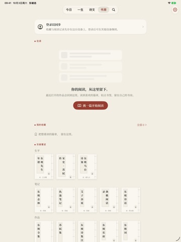
iPad screenshots


Icon palette
About this app
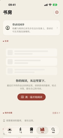
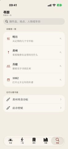
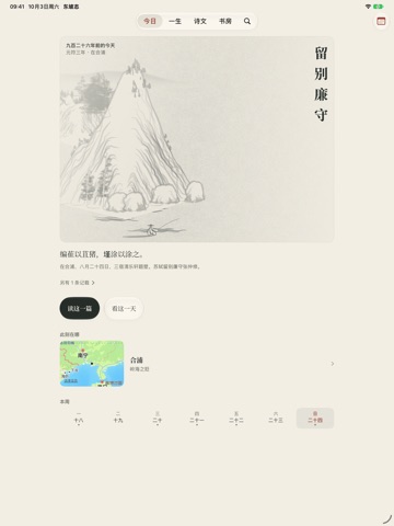
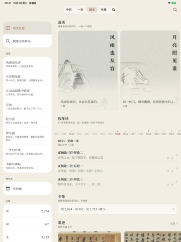
读一篇诗文,走近一个人的一生。 东坡志是一部关于苏轼的随身书。它把诗词文赋、一生的年谱和走过的地方放在同一处:从一篇作品读到一段处境,再从一段处境回到下一篇文字。 【今日】 每天读一篇,配上导读与山水画屏,也能继续上次的阅读。「旧日此时」按农历日期翻阅年谱记载;没有恰好同日的,就读最近的一天。 【一生】 从眉山到黄州,至惠州、儋州,再到常州。八个人生篇章串联作品、经历与时代背景,地图与年谱提供不同的阅读入口;重要人物的往来另有说明。篇章导读与古典原文分别呈现。 【诗文】 阅读苏轼的诗、词、文、赋,按文体浏览,也可检索诗题与文字。横排、竖排和简繁显示可切换。「风雨也从容」「月亮照见谁」等主题合集,把彼此照应的诗文连在一起读。原文保留底本异文与异体字,导读帮助理解作品的阅读背景。 【书房】 收藏篇目,记下读到哪里,写几行笔记。无需绑定手机号即可开始阅读;账号功能可将收藏、进度和笔记同步到自己的账号。书画与典籍另有阅读入口,《黄州寒食诗帖》《前赤壁赋》《木石图》等图版附馆藏著录、图像来源和观看提…
App details
What you can learn from 东坡志
Every shipping app on the App Store has gone through the same decisions you're working through right now: which screenshot goes first, what caption sits over it, which device frame to show, what color the background should be. The 10 screenshots above are 东坡志's answers to those questions — they're public, they're real, and they made it through Apple's review.
What the numbers say: 东坡志 runs a light set with one background colour (#F4ECE4) carried across every screenshot — the listing reads as a single poster when the shots sit side by side in search results. The accent colour we picked up, #6CCCFC, is the one to reuse for badges, arrows and highlighted words if you borrow this look. Hit Use this style to open the editor with these exact colours and drop your own screenshot in.
Notice the first screenshot in particular. It's the one users see in search results and on the product page, and it's where most apps spend their best caption and tightest design. Look at the proportion of background to phone, where the text sits, what one thing the image is trying to communicate.
Want to see how other Book apps approach the same problem? Browse more Book apps in the showcase.
Take what works into your own screenshots
Open LaunchShots and design your App Store & Google Play screenshots — pick a device frame, drop captions, ship in minutes. Free, in your browser.
Open the screenshot editor →Apps with a similar look
Closest background + accent colours among the listings we've analysed — useful when you want to see the same palette handled by a different team.