Chart position — tracked daily by LaunchShots
Screenshot changes — detected by LaunchShots
Screenshot style breakdown
Sampled from 5 of Sách hay - tải và đọc dễ dàng's App Store screenshots — background, accent and theme, measured by LaunchShots (not something Apple publishes).
#FCFCFC bg
#DDDDDD
#DC0414 accent
#111111 text
Reading the caption text from the screenshots in your browser…
Screenshots


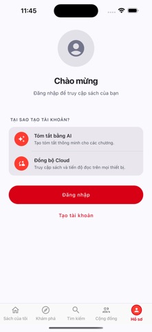
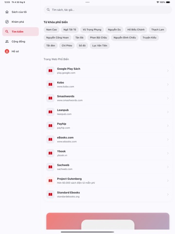
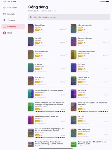
iPad screenshots



Icon palette
About this app
Sách là ứng dụng đọc sách miễn phí cho iPhone và iPad. Không gói đăng ký, không mua trong ứng dụng. KHO SÁCH VIỆT Hàng trăm tác phẩm tiếng Việt đã hết thời hạn bảo hộ hoặc được cộng đồng số hoá, lấy từ Wikisource tiếng Việt: Truyện Kiều, Tắt đèn, Chí Phèo, Việt Nam sử lược, Việt Nam phong tục, Tam quốc diễn nghĩa bản Phan Kế Bính, Vũ trung tùy bút, Quốc văn trích diễm và nhiều tác phẩm khác. Mỗi cuốn đều ghi rõ nguồn và giấy phép. SÁCH NGOẠI VĂN KÈM AI Gần 300 tác phẩm kinh điển thế giới thuộc phạm vi công cộng từ Project Gutenberg. Tóm tắt từng chương và dịch sang tiếng Việt ngay trong lúc đọc, miễn phí cho mọi người dùng. SÁCH CỦA RIÊNG BẠN Mở tệp EPUB và PDF bạn tự thêm vào máy. Tìm và tải sách từ internet ngay trong ứng dụng. TRÌNH ĐỌC - Đổi phông chữ, cỡ chữ, màu nền và giãn dòng - Chế độ đêm dịu mắt - Tự nhớ vị trí đang đọc của từng cuốn - Đánh dấu trang - Đọc offline hoàn toà…
App details
What you can learn from Sách hay - tải và đọc dễ dàng
Every shipping app on the App Store has gone through the same decisions you're working through right now: which screenshot goes first, what caption sits over it, which device frame to show, what color the background should be. The 10 screenshots above are Sách hay - tải và đọc dễ dàng's answers to those questions — they're public, they're real, and they made it through Apple's review.
What the numbers say: Sách hay - tải và đọc dễ dàng runs a light set with one background colour (#FCFCFC) carried across every screenshot — the listing reads as a single poster when the shots sit side by side in search results. The accent colour we picked up, #DC0414, is the one to reuse for badges, arrows and highlighted words if you borrow this look. Hit Use this style to open the editor with these exact colours and drop your own screenshot in.
Notice the first screenshot in particular. It's the one users see in search results and on the product page, and it's where most apps spend their best caption and tightest design. Look at the proportion of background to phone, where the text sits, what one thing the image is trying to communicate.
Want to see how other Book apps approach the same problem? Browse more Book apps in the showcase.
Take what works into your own screenshots
Open LaunchShots and design your App Store & Google Play screenshots — pick a device frame, drop captions, ship in minutes. Free, in your browser.
Open the screenshot editor →Apps with a similar look
Closest background + accent colours among the listings we've analysed — useful when you want to see the same palette handled by a different team.