Chart position — tracked daily by LaunchShots
Screenshot style breakdown
Sampled from 6 of جامع الكتب التسعة's App Store screenshots — background, accent and theme, measured by LaunchShots (not something Apple publishes).
#543C34 bg
#6B5750
#CCAC64 accent
#FFFFFF text
Screenshots
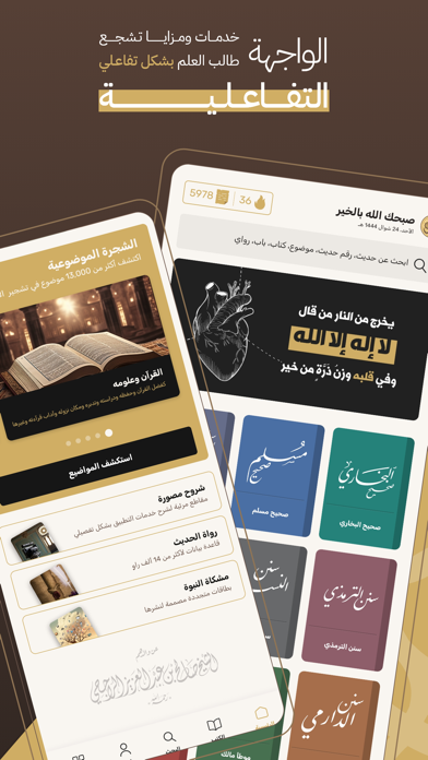
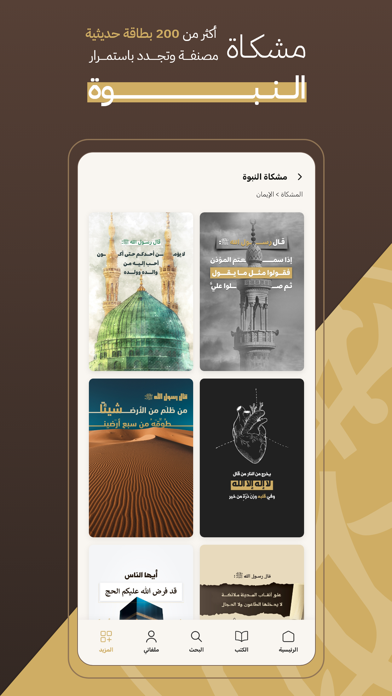
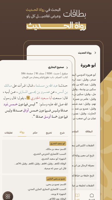
iPad screenshots
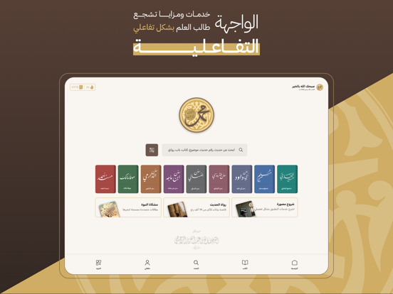
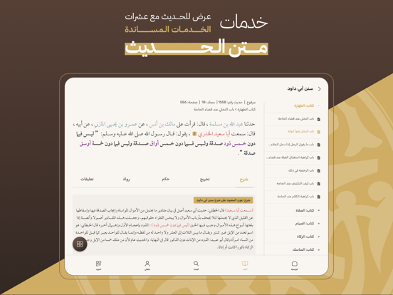


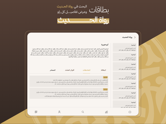
Icon palette
About this app
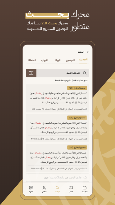
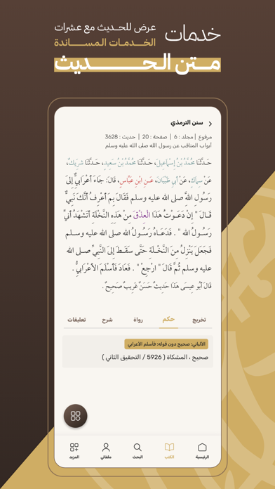
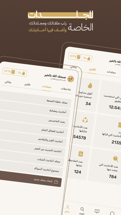
جامع الكتب التسعة أدق وأشمل تطبيق إسلامي خاص بعلم الحديث النبوي الشريف يشتمل على كتب الحديث التسعة المشهورة لدى علماء السنة النبوية الشريفة والتي تعتبر أهم المراجع وأوفاها وأشملها للحديث الشريف والتي تتضمن فتح الباري شرح صحيح البخاري و كتاب صحيح مسلم بشرح النووي وكذلك السنن الأربعة وهي ،عون المعبود شرح سنن أبي داود وتحفة الأحوذي شرح سنن الترمذي وحاشية السندي على كل من سنن النسائي ،سنن بن ماجة ، سنن الدارمي و مسند الإمام أحمد بن حنبل ولا يفوتنا ذكر المنتقى شرح موطأ الإمام مالك، ليكون التطبيق موسوعة الحديث الشريف لكل طالب علم في الحديث لاكتشاف الدرر السنية في هدي النبي صلى الله عليه وسلم. مزايا التطبيق * كتب الحديث التسعة * عرض لجميع الكتب التسعة بشروحها وفقا لأدق النسخ تحقيقا. * رواة الحديث * التعريف برواة الأحاديث الشريفة الحديث سند الكتب التسع. * البحث * بحث متقدم بكلمة ، جزئ من حديث أو برقم الحديث وكذلك البحث بأبواب الكتب. * الشجرة الموضوعية * تقسيم موضوعي لكامل أحاديث الكتب ا…
App details
What you can learn from جامع الكتب التسعة
Every shipping app on the App Store has gone through the same decisions you're working through right now: which screenshot goes first, what caption sits over it, which device frame to show, what color the background should be. The 13 screenshots above are جامع الكتب التسعة's answers to those questions — they're public, they're real, and they made it through Apple's review.
What the numbers say: جامع الكتب التسعة runs a mixed light-and-dark set where the background shifts from screenshot to screenshot (first shot #543C34) — each image has to stand on its own, so the captions carry more of the story. The accent colour we picked up, #CCAC64, is the one to reuse for badges, arrows and highlighted words if you borrow this look. Hit Use this style to open the editor with these exact colours and drop your own screenshot in.
Notice the first screenshot in particular. It's the one users see in search results and on the product page, and it's where most apps spend their best caption and tightest design. Look at the proportion of background to phone, where the text sits, what one thing the image is trying to communicate.
Want to see how other Book apps approach the same problem? Browse more Book apps in the showcase.
Take what works into your own screenshots
Open LaunchShots and design your App Store & Google Play screenshots — pick a device frame, drop captions, ship in minutes. Free, in your browser.
Open the screenshot editor →Apps with a similar look
Closest background + accent colours among the listings we've analysed — useful when you want to see the same palette handled by a different team.