Chart position — tracked daily by LaunchShots
Screenshot changes — detected by LaunchShots
Screenshot style breakdown
Sampled from 6 of Fluffy Drop's App Store screenshots — background, accent and theme, measured by LaunchShots (not something Apple publishes).
#64443C bg
#795E57
#D4945C accent
#FFFFFF text
Screenshots

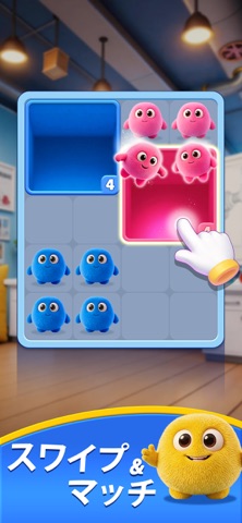

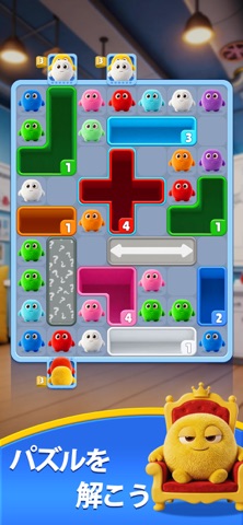


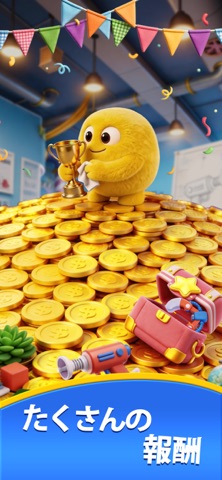
iPad screenshots

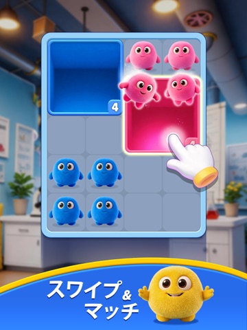



Icon palette
About this app
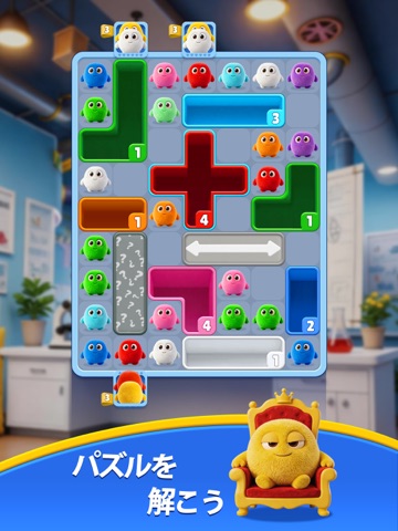
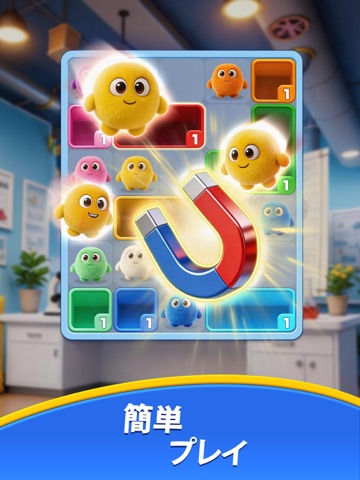
Fluffy Drop – ふわふわパズルアドベンチャー ひと手ごとに、心がはずむ ふわふわボールを同じ色のエリアに導く、シンプルで奥深いパズルゲーム。 ドラッグ&ドロップの爽快感と、色合わせの戦略が絶妙にマッチ。 ボードをきれいに埋めて、次の一手を考えるたびに、心地よい達成感が広がります。 パズル初心者も、脳トレ気分の人も、誰でも楽しめるやさしい世界へ。 Fluffy Dropのここが魅力: - 気持ちいいドラッグ操作 – 簡単だけど、やりごたえ十分。 - 多数の癒しレベル – やさしい入門から頭を使った難問まで、幅広く挑戦を用意。 - カラフルでなめらかな演出 – そっと動くアニメーションがマッチのたびに嬉しさをプラス。 - 戦略的プレイ – 次の一手を読み、連鎖を生み出す快感。 - オフラインでも遊べる – Wi-Fiがなくてもどこでも楽しめる。 さあ、ふわふわの世界に飛び込もう。 今すぐダウンロードして、あなただけのパズルの幸せを見つけてください。
App details
What you can learn from Fluffy Drop
Every shipping app on the App Store has gone through the same decisions you're working through right now: which screenshot goes first, what caption sits over it, which device frame to show, what color the background should be. The 14 screenshots above are Fluffy Drop's answers to those questions — they're public, they're real, and they made it through Apple's review.
What the numbers say: Fluffy Drop runs a dark set where the background shifts from screenshot to screenshot (first shot #64443C) — each image has to stand on its own, so the captions carry more of the story. The accent colour we picked up, #D4945C, is the one to reuse for badges, arrows and highlighted words if you borrow this look. Hit Use this style to open the editor with these exact colours and drop your own screenshot in.
Notice the first screenshot in particular. It's the one users see in search results and on the product page, and it's where most apps spend their best caption and tightest design. Look at the proportion of background to phone, where the text sits, what one thing the image is trying to communicate.
Want to see how other Games apps approach the same problem? Browse more Games apps in the showcase.
Take what works into your own screenshots
Open LaunchShots and design your App Store & Google Play screenshots — pick a device frame, drop captions, ship in minutes. Free, in your browser.
Open the screenshot editor →Apps with a similar look
Closest background + accent colours among the listings we've analysed — useful when you want to see the same palette handled by a different team.