Chart position — tracked daily by LaunchShots
Screenshot style breakdown
Sampled from 5 of KirolTxartela Mugiment's App Store screenshots — background, accent and theme, measured by LaunchShots (not something Apple publishes).
#FCFCFC bg
#DDDDDD
#4C9C8C accent
#111111 text
Screenshots
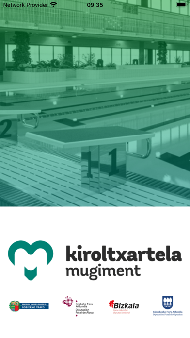
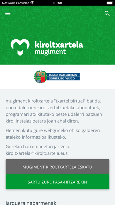
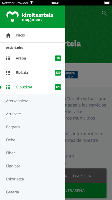
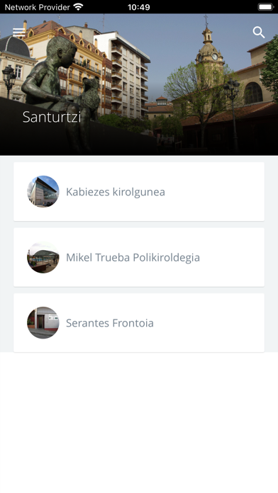
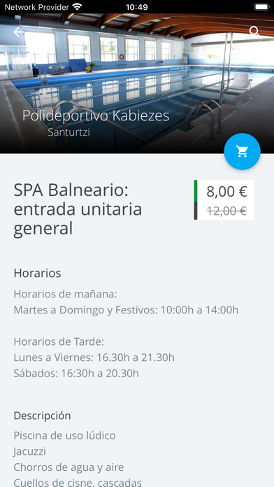
iPad screenshots


Icon palette
About this app
KirolTxartela Mugiment "txartel birtual" bat da, non udalerrien kirol zerbitzuetako abonatuek, programari atxikitutako beste udalerri batzuen kirol instalazioetara joan ahal diren. - Eusko Jaurlaritzak eta Foru Aldundiek sustatutako proiektu bat da, atxikitako udalerrikin batera. - KirolTxartela Mugiment-ren helburua da kirola sustatzea eta herritarrei egindako kirol eskaintza handitzea. - Txartel birtuala denez, APPa baino ez da instalatu behar. - Udalerri bakoitzeko abonatuak beste udalen kirol instalazioetara sartu ahalko dira, gastu gehigarririk barik, udal bakoitzak ezarritako erabilgarritasunaren arabera. KirolTxartela Mugiment es una "tarjeta virtual" que permite a los abonados y abonadas a los servicios municipales de deportes, acceder a las instalaciones deportivas de otros municipios adscritos al programa. - Es un proyecto impulsado por el Gobierno Vasco y las Diputación For…
App details
What you can learn from KirolTxartela Mugiment
Every shipping app on the App Store has gone through the same decisions you're working through right now: which screenshot goes first, what caption sits over it, which device frame to show, what color the background should be. The 10 screenshots above are KirolTxartela Mugiment's answers to those questions — they're public, they're real, and they made it through Apple's review.
What the numbers say: KirolTxartela Mugiment runs a light set with one background colour (#FCFCFC) carried across every screenshot — the listing reads as a single poster when the shots sit side by side in search results. The accent colour we picked up, #4C9C8C, is the one to reuse for badges, arrows and highlighted words if you borrow this look. Hit Use this style to open the editor with these exact colours and drop your own screenshot in.
Notice the first screenshot in particular. It's the one users see in search results and on the product page, and it's where most apps spend their best caption and tightest design. Look at the proportion of background to phone, where the text sits, what one thing the image is trying to communicate.
Want to see how other Sports apps approach the same problem? Browse more Sports apps in the showcase.
Take what works into your own screenshots
Open LaunchShots and design your App Store & Google Play screenshots — pick a device frame, drop captions, ship in minutes. Free, in your browser.
Open the screenshot editor →Apps with a similar look
Closest background + accent colours among the listings we've analysed — useful when you want to see the same palette handled by a different team.