Screenshot style breakdown
Sampled from 5 of Partenaire PASS' Région's App Store screenshots — background, accent and theme, measured by LaunchShots (not something Apple publishes).
#FCFCFC bg
#DDDDDD
#347CB4 accent
#111111 text
Screenshots
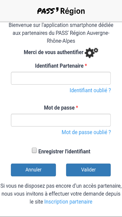
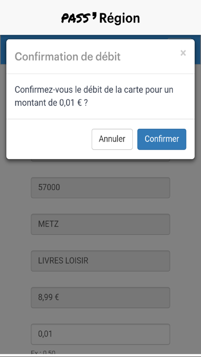
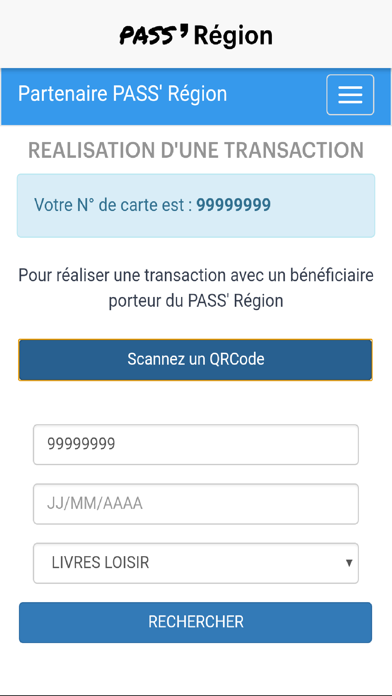
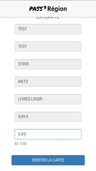
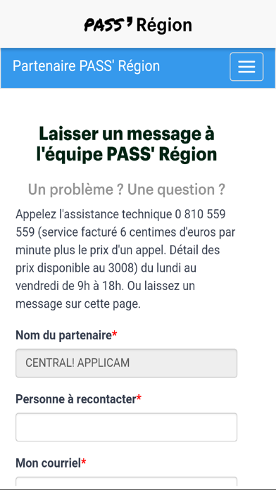
iPad screenshots
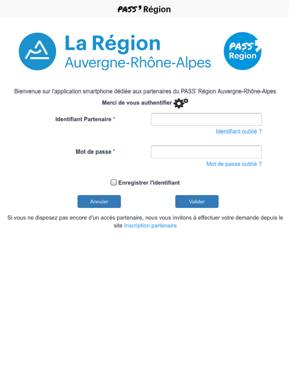


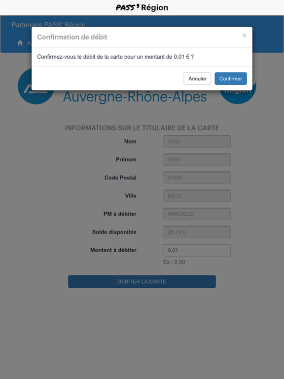
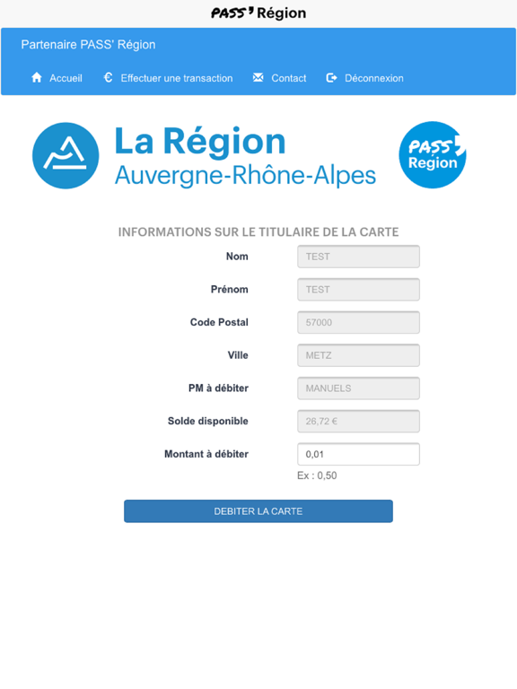
Icon palette
About this app
L’application Partenaire PASS’ Région est réservée aux partenaires conventionnés du dispositif PASS’ Région, mis en œuvre par la Région Auvergne-Rhône-Alpes pour les lycéens, apprentis, jeunes inscrits en mission locale, en IME/IMPRO, en formations sanitaires et sociales… Ces partenaires peuvent être : libraires, associations de parents d'élèves, associations sportives, salles de cinéma, fournisseurs d'équipements professionnels, musées et salles d'exposition, salles de spectacles... L’application Partenaire PASS’ Région permet, après identification avec l'identifiant et le mot de passe partenaire, de réaliser des transactions avec les bénéficiaires qui présentent leur PASS’ Région (via leur carte ou l'application mobile). Vous n’êtes pas encore partenaire et vous souhaitez le devenir ? Rendez-vous sur https://jeunes.auvergnerhonealpes.fr/partenaires pour effectuer votre demande de c…
App details
What you can learn from Partenaire PASS' Région
Every shipping app on the App Store has gone through the same decisions you're working through right now: which screenshot goes first, what caption sits over it, which device frame to show, what color the background should be. The 10 screenshots above are Partenaire PASS' Région's answers to those questions — they're public, they're real, and they made it through Apple's review.
What the numbers say: Partenaire PASS' Région runs a mixed light-and-dark set where the background shifts from screenshot to screenshot (first shot #FCFCFC) — each image has to stand on its own, so the captions carry more of the story. The accent colour we picked up, #347CB4, is the one to reuse for badges, arrows and highlighted words if you borrow this look. Hit Use this style to open the editor with these exact colours and drop your own screenshot in.
Notice the first screenshot in particular. It's the one users see in search results and on the product page, and it's where most apps spend their best caption and tightest design. Look at the proportion of background to phone, where the text sits, what one thing the image is trying to communicate.
Want to see how other News apps approach the same problem? Browse more News apps in the showcase.
Take what works into your own screenshots
Open LaunchShots and design your App Store & Google Play screenshots — pick a device frame, drop captions, ship in minutes. Free, in your browser.
Open the screenshot editor →Apps with a similar look
Closest background + accent colours among the listings we've analysed — useful when you want to see the same palette handled by a different team.