Chart position — tracked daily by LaunchShots
Screenshot changes — detected by LaunchShots
Screenshot style breakdown
Sampled from 6 of Amplificador De Volumen - Hear's App Store screenshots — background, accent and theme, measured by LaunchShots (not something Apple publishes).
#545C7C bg
#6B728E
#E49464 accent
#FFFFFF text
Screenshots


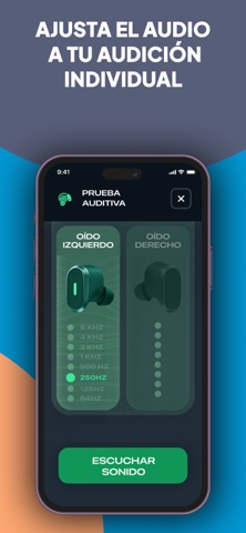
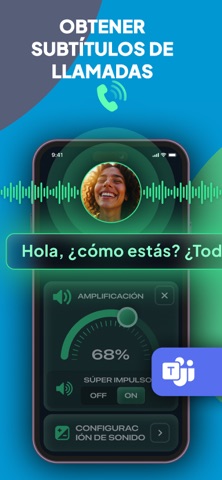

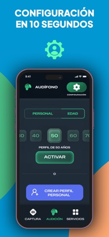
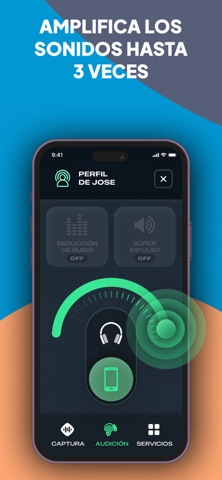


iPad screenshots


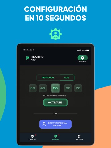
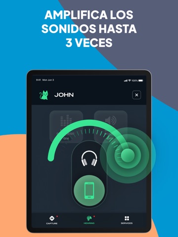

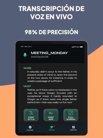
Icon palette
About this app
DISPOSITIVO DE ESCUCHA + AMPLIFICADOR DE SONIDO 4 Música y Video + SUBTÍTULOS DE LLAMADAS + Personalizado para personas con dificultades auditivas ◆El dispositivo de escucha ofrece una potente amplificación de sonido para una audición más nítida en el día a día. ◆Mejora la claridad del habla. ◆Reduce el ruido de fondo. ◆Afina el audio para auriculares y dispositivos Bluetooth. ◆Transcripción en vivo para llamadas y conversaciones. NUEVAS FUNCIONES: ◆► Sonido personalizado para video y música Disfruta de videos con volumen mejorado directamente en la app. Utiliza tu perfil auditivo personalizado para una claridad óptima, con ajustes adicionales para ajustar el sonido según el contenido. ◆► Transcripción en vivo Transcribe voz en tiempo real, incluso con la pantalla bloqueada. Perfecto para tomar notas continuamente durante reuniones, conferencias o conversaciones. ◆► Transcribe desde…
App details
What you can learn from Amplificador De Volumen - Hear
Every shipping app on the App Store has gone through the same decisions you're working through right now: which screenshot goes first, what caption sits over it, which device frame to show, what color the background should be. The 18 screenshots above are Amplificador De Volumen - Hear's answers to those questions — they're public, they're real, and they made it through Apple's review.
What the numbers say: Amplificador De Volumen - Hear runs a dark set where the background shifts from screenshot to screenshot (first shot #545C7C) — each image has to stand on its own, so the captions carry more of the story. The accent colour we picked up, #E49464, is the one to reuse for badges, arrows and highlighted words if you borrow this look. Hit Use this style to open the editor with these exact colours and drop your own screenshot in.
Notice the first screenshot in particular. It's the one users see in search results and on the product page, and it's where most apps spend their best caption and tightest design. Look at the proportion of background to phone, where the text sits, what one thing the image is trying to communicate.
Want to see how other Medical apps approach the same problem? Browse more Medical apps in the showcase.
Take what works into your own screenshots
Open LaunchShots and design your App Store & Google Play screenshots — pick a device frame, drop captions, ship in minutes. Free, in your browser.
Open the screenshot editor →Apps with a similar look
Closest background + accent colours among the listings we've analysed — useful when you want to see the same palette handled by a different team.