Chart position — tracked daily by LaunchShots
Screenshot style breakdown
Sampled from 6 of Boksammanfattning StoryShots's App Store screenshots — background, accent and theme, measured by LaunchShots (not something Apple publishes).
#F4F4F4 bg
#D6D6D6
#FC5404 accent
#111111 text
- #1Unlimited Key Insights 300,000 Bestsellers & New Releases
- #2Top Education App
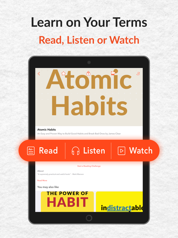
- #3Read & Listen Offline Bite-size Summaries & Full Books
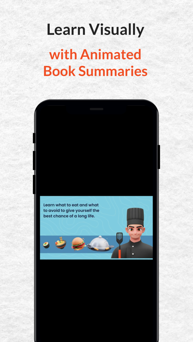
- #4Learn Visually with Animated Book Summaries
- #5Printable Infographics See an entire book on 1 page
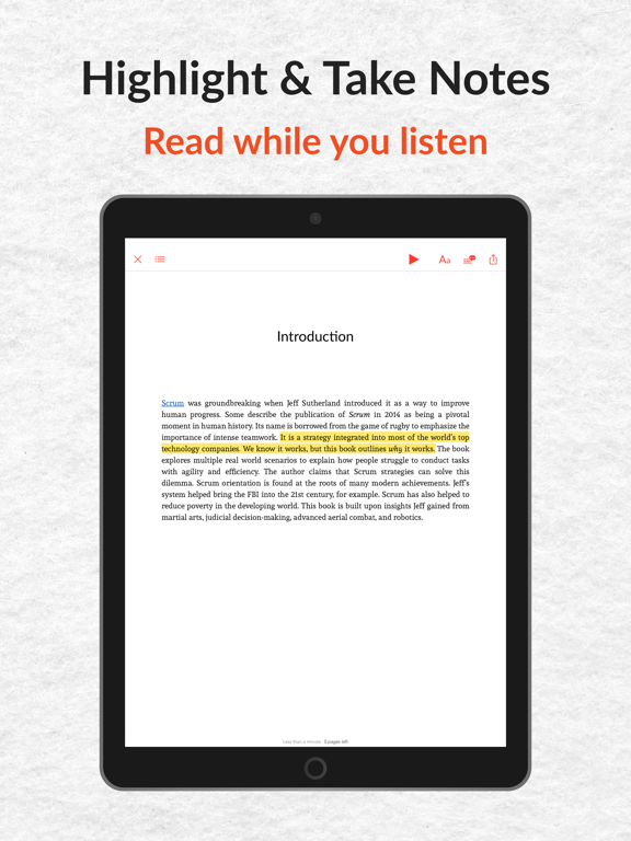
- #6Highlight & Take Notes Read while you listen
Captions read from the screenshots (OCR, may contain small errors): 6 headlines, 7.2 words on average (longest 9).
Screenshots




iPad screenshots



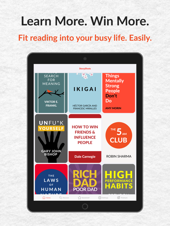


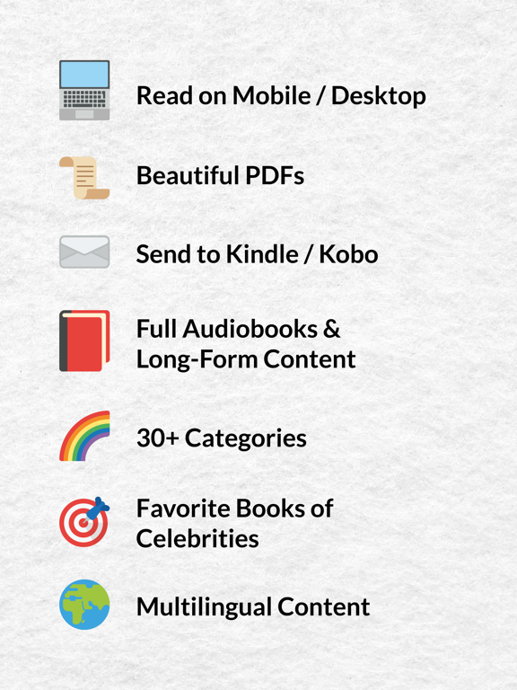
Icon palette
About this app
OBEGRÄNSADE GRATIS BOKSAMMANFATTNINGAR Välj bland över 1 miljon sammanfattningar - bästsäljare och nyheter inkluderade! VARFÖR StoryShots? * Utsedd till #1 av Apple, The Guardian, TechCrunch och Google * 4,7 i globalt betyg från över 10 000 användare * Med 1 miljon+ sammanfattningar — världens största samling * Krönt till BÄSTA UTBILDNINGSAPP av TechCrunch * En av världens BÄSTA MICROLEARNING-APPAR enligt The Guardian * Innehåll på 8 språk * Kurerade läslistor från Andrew Huberman och Lex Fridman, mm GRATIS LJUDBÖCKER OCH SAMMANFATTNINGAR Ta del av kärnidéerna i över 400 bästsäljare gratis. Med StoryShots AI når du idéerna i 1 miljon fler titlar. BYGG EN DAGLIG LÄSVANA Streaks håller dig igång: öppna appen, läs en sammanfattning, håll serien vid liv. Köa ljud-Shots i spellistor och fortsätt lyssna med miniuppspelaren medan du bläddrar. MULTIMEDIA: LÄS, LYSSNA ELLER LÄR VISUELLT Stor…
App details
What you can learn from Boksammanfattning StoryShots
Every shipping app on the App Store has gone through the same decisions you're working through right now: which screenshot goes first, what caption sits over it, which device frame to show, what color the background should be. The 19 screenshots above are Boksammanfattning StoryShots's answers to those questions — they're public, they're real, and they made it through Apple's review.
What the numbers say: Boksammanfattning StoryShots runs a light set with one background colour (#F4F4F4) carried across every screenshot — the listing reads as a single poster when the shots sit side by side in search results. The accent colour we picked up, #FC5404, is the one to reuse for badges, arrows and highlighted words if you borrow this look. Hit Use this style to open the editor with these exact colours and drop your own screenshot in.
Notice the first screenshot in particular. It's the one users see in search results and on the product page, and it's where most apps spend their best caption and tightest design. Look at the proportion of background to phone, where the text sits, what one thing the image is trying to communicate.
Want to see how other Book apps approach the same problem? Browse more Book apps in the showcase.
Take what works into your own screenshots
Open LaunchShots and design your App Store & Google Play screenshots — pick a device frame, drop captions, ship in minutes. Free, in your browser.
Open the screenshot editor →Apps with a similar look
Closest background + accent colours among the listings we've analysed — useful when you want to see the same palette handled by a different team.