Chart position — tracked daily by LaunchShots
Screenshot style breakdown
Sampled from 6 of A,B,C,D,Taxi,Taxiåkeri - Teori's App Store screenshots — background, accent and theme, measured by LaunchShots (not something Apple publishes).
#FCFCFC bg
#DDDDDD
#4464B4 accent
#111111 text
- #1KORKORT
- #2Category (s) Obetald Taxiférarlegitimation Köpa
- #3< > ova EH Test
- #4< Test Välj en parm! Pärm 01
- #5Pärm 01 00:00:21 | @) Fraga 1/70 Förklaring O Markera Du kommer fram till ett övergångsstä
- #6Pärm 01 00:00:38 | @) Fraga 11/70 Förklaring O Markera Vilken vätska innehåller behållaren
Captions read from the screenshots (OCR, may contain small errors): 6 headlines, 8 words on average (longest 16).
Screenshots


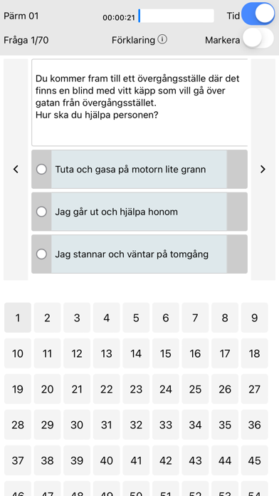


iPad screenshots


Icon palette
About this app
Få ditt körkort enklare med vår app för A, B, C, D, och taxiteori appar. Dessutom erbjuder appen YKB utbildningar både för buss och lastbil, gods åkeri och ADR utbildning. Vår app ger dig möjlighet att öva och testa dina teorikunskaper när och var du vill. Den är en förenklad version av det material som erbjuds på en traditionell trafikskola, anpassad för din bekvämlighet. Börja med att öva dina kunskaper med olika pärmar för att sedan gå över till test. Du har tillgång till obegränsade antal tester. Efter varje test kan du se hur många procent rätt du fick så att du kan se hur utvecklingen fortskrider. BCD och taxi teori appar skiljer sig från alla andra appar för att du har valmöjligheten att plugga i andra språk bland annat engelska och arabiska. Så varför väntar du Ladda ner appen idag.
App details
What you can learn from A,B,C,D,Taxi,Taxiåkeri - Teori
Every shipping app on the App Store has gone through the same decisions you're working through right now: which screenshot goes first, what caption sits over it, which device frame to show, what color the background should be. The 18 screenshots above are A,B,C,D,Taxi,Taxiåkeri - Teori's answers to those questions — they're public, they're real, and they made it through Apple's review.
What the numbers say: A,B,C,D,Taxi,Taxiåkeri - Teori runs a light set with one background colour (#FCFCFC) carried across every screenshot — the listing reads as a single poster when the shots sit side by side in search results. The accent colour we picked up, #4464B4, is the one to reuse for badges, arrows and highlighted words if you borrow this look. Hit Use this style to open the editor with these exact colours and drop your own screenshot in.
Notice the first screenshot in particular. It's the one users see in search results and on the product page, and it's where most apps spend their best caption and tightest design. Look at the proportion of background to phone, where the text sits, what one thing the image is trying to communicate.
Want to see how other Education apps approach the same problem? Browse more Education apps in the showcase.
Take what works into your own screenshots
Open LaunchShots and design your App Store & Google Play screenshots — pick a device frame, drop captions, ship in minutes. Free, in your browser.
Open the screenshot editor →Apps with a similar look
Closest background + accent colours among the listings we've analysed — useful when you want to see the same palette handled by a different team.