Chart position — tracked daily by LaunchShots
Screenshot style breakdown
Sampled from 5 of МосОблЕИРЦ Онлайн's App Store screenshots — background, accent and theme, measured by LaunchShots (not something Apple publishes).
#FCFCFC bg
#DDDDDD
#FCB41C accent
#111111 text
Screenshots
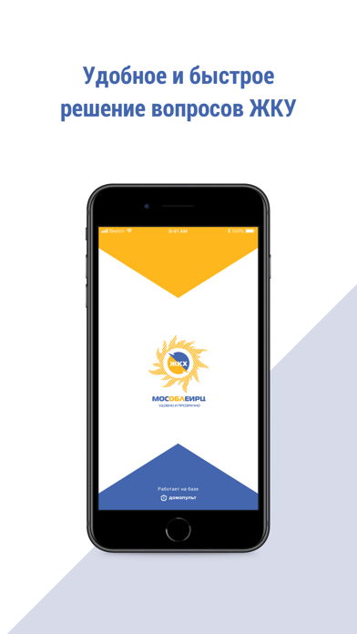
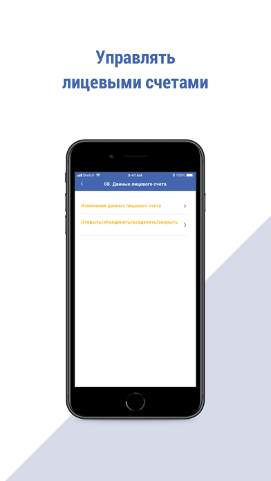

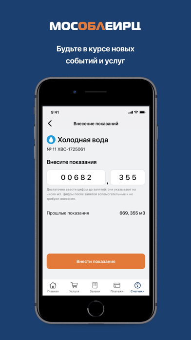

Icon palette
About this app
ООО «МосОблЕИРЦ» представляет обновленное удобное приложение «МосОблЕИРЦ Онлайн». Хорошие новости: больше не нужно идти в офис или звонить в контактный центр МосОблЕИРЦ. Простое в использовании приложение поможет Вам: - оплатить коммунальные счета онлайн без банковской комиссии; - передать показания приборов учета, - отследить дату поверки счетчика; - заказать справку, - управлять несколькими лицевыми счетами – ваших родителей, например, или пожилых родственников. Что еще интересного в приложении? Сервис «Умная платежка» поможет разобраться в начислениях. Вы можете увидеть формулы расчета платы за любую из услуг, тарифы, объемы потребления, льготы, пени. Обновился сервис «Услуги для Вашего дома», где десятки компаний готовы помочь быстро и по разумной цене решить коммунальные вопросы, от ремонта квартиры до помощи домашним питомцам. «МосОблЕИРЦ Онлайн» позаботится о том, чтобы Вы …
App details
What you can learn from МосОблЕИРЦ Онлайн
Every shipping app on the App Store has gone through the same decisions you're working through right now: which screenshot goes first, what caption sits over it, which device frame to show, what color the background should be. The 5 screenshots above are МосОблЕИРЦ Онлайн's answers to those questions — they're public, they're real, and they made it through Apple's review.
What the numbers say: МосОблЕИРЦ Онлайн runs a mixed light-and-dark set where the background shifts from screenshot to screenshot (first shot #FCFCFC) — each image has to stand on its own, so the captions carry more of the story. The accent colour we picked up, #FCB41C, is the one to reuse for badges, arrows and highlighted words if you borrow this look. Hit Use this style to open the editor with these exact colours and drop your own screenshot in.
Notice the first screenshot in particular. It's the one users see in search results and on the product page, and it's where most apps spend their best caption and tightest design. Look at the proportion of background to phone, where the text sits, what one thing the image is trying to communicate.
Want to see how other Finance apps approach the same problem? Browse more Finance apps in the showcase.
Take what works into your own screenshots
Open LaunchShots and design your App Store & Google Play screenshots — pick a device frame, drop captions, ship in minutes. Free, in your browser.
Open the screenshot editor →Apps with a similar look
Closest background + accent colours among the listings we've analysed — useful when you want to see the same palette handled by a different team.