Screenshot style breakdown
Sampled from 5 of Bois Jacques Bastogne's App Store screenshots — background, accent and theme, measured by LaunchShots (not something Apple publishes).
#ECDCD4 bg
#CFC1BA
#8CA44C accent
#111111 text
Screenshots

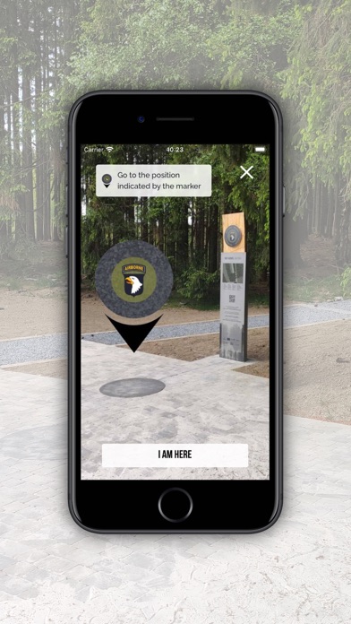
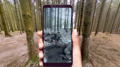
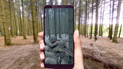

iPad screenshots


Icon palette
About this app
Duik in het hart van Bois Jacques met de Easy Company tijdens een unieke, levensechte reis in Overlap Reality®, een door SkyBoy ontwikkelde technologie die de effecten van augmented reality versterkt. Tijdens de Tweede Wereldoorlog was Bois Jacques, een historische locatie die van groot belang was tijdens het Ardennenoffensief, het toneel van zware gevechten tussen de Amerikaanse en Duitse legers. In december 1944 ligt Bastenaken op de route van het Duitse Vijfde Pantserleger. De Duitsers hebben een duidelijk plan. Ze willen Bastenaken, een belangrijk kruispunt, zo snel mogelijk innemen en vervolgens doorstoten naar de Maas: de 130e Panzer-Lehr-Division moet de stad bij verrassing innemen, terwijl de Panzer Division 2 eromheen trekt richting de Maas. Intussen moet de Volksgrenadier-Division 26 de verzetshaard aanvallen. Maar de Amerikanen, die in het gebied aanwezig zijn of in vracht…
App details
What you can learn from Bois Jacques Bastogne
Every shipping app on the App Store has gone through the same decisions you're working through right now: which screenshot goes first, what caption sits over it, which device frame to show, what color the background should be. The 9 screenshots above are Bois Jacques Bastogne's answers to those questions — they're public, they're real, and they made it through Apple's review.
What the numbers say: Bois Jacques Bastogne runs a mixed light-and-dark set where the background shifts from screenshot to screenshot (first shot #ECDCD4) — each image has to stand on its own, so the captions carry more of the story. The accent colour we picked up, #8CA44C, is the one to reuse for badges, arrows and highlighted words if you borrow this look. Hit Use this style to open the editor with these exact colours and drop your own screenshot in.
Notice the first screenshot in particular. It's the one users see in search results and on the product page, and it's where most apps spend their best caption and tightest design. Look at the proportion of background to phone, where the text sits, what one thing the image is trying to communicate.
Want to see how other Education apps approach the same problem? Browse more Education apps in the showcase.
Take what works into your own screenshots
Open LaunchShots and design your App Store & Google Play screenshots — pick a device frame, drop captions, ship in minutes. Free, in your browser.
Open the screenshot editor →Apps with a similar look
Closest background + accent colours among the listings we've analysed — useful when you want to see the same palette handled by a different team.