Chart position — tracked daily by LaunchShots
Screenshot style breakdown
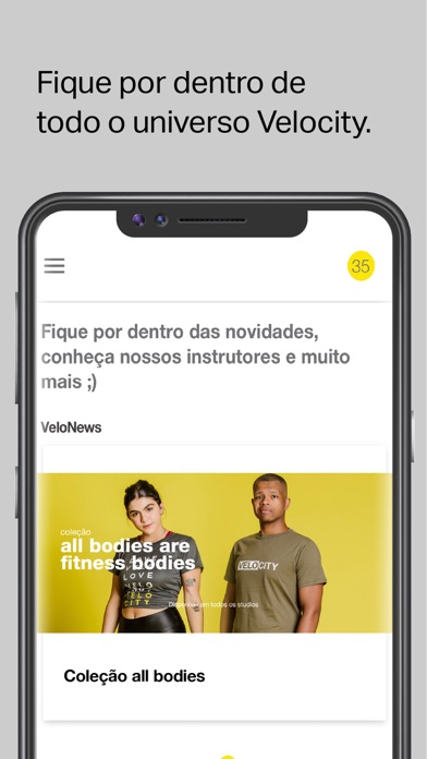
Sampled from 5 of Studio Velocity: Bike Indoor's App Store screenshots — background, accent and theme, measured by LaunchShots (not something Apple publishes).
#CCC4D4 bg
#B3ACBA
#B47C74 accent
#111111 text
Screenshots
Icon palette
About this app
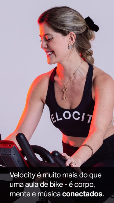
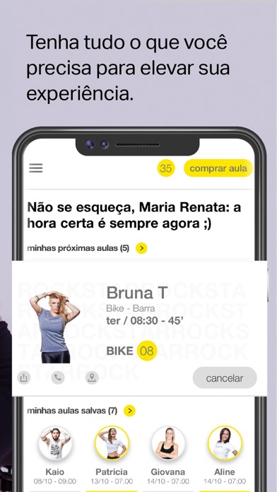
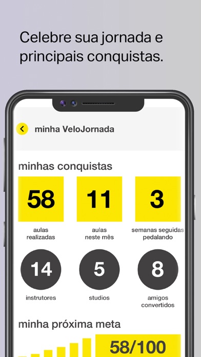
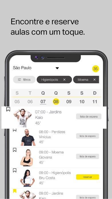
Sensações únicas. Playlists épicas. Instrutores magnéticos. Velocity é muito mais que uma aula de bike indoor. É uma experiência revolucionária, que conecta corpo, mente, alma e música. Diariamente, nos studios de todo o Brasil, nossos alunos encontram prazer no movimento: liberam estresse, queimam calorias, tonificam os músculos, descobrem seus potenciais e transformam suas vidas. As aulas da Velocity têm 45min e incluem cardio de alta intensidade, movimentos ritmados e exercícios para os braços com pesos. Nós dançamos, cantamos, curtimos. É como uma festa... ou uma terapia em movimento. O app oficial da Velocity torna a reserva de aulas muito mais fácil e simples, on the go. Também te permite salvar aquelas aulas que você sempre costuma fazer, facilitando seus agendamentos recorrentes. Quer saber em qual bike você está na aula? Veja todas as suas reservas com um só toque. Tenha todo …
App details
What you can learn from Studio Velocity: Bike Indoor
Every shipping app on the App Store has gone through the same decisions you're working through right now: which screenshot goes first, what caption sits over it, which device frame to show, what color the background should be. The 5 screenshots above are Studio Velocity: Bike Indoor's answers to those questions — they're public, they're real, and they made it through Apple's review.
What the numbers say: Studio Velocity: Bike Indoor runs a light set with one background colour (#CCC4D4) carried across every screenshot — the listing reads as a single poster when the shots sit side by side in search results. The accent colour we picked up, #B47C74, is the one to reuse for badges, arrows and highlighted words if you borrow this look. Hit Use this style to open the editor with these exact colours and drop your own screenshot in.
Notice the first screenshot in particular. It's the one users see in search results and on the product page, and it's where most apps spend their best caption and tightest design. Look at the proportion of background to phone, where the text sits, what one thing the image is trying to communicate.
Want to see how other Health & Fitness apps approach the same problem? Browse more Health & Fitness apps in the showcase.
Take what works into your own screenshots
Open LaunchShots and design your App Store & Google Play screenshots — pick a device frame, drop captions, ship in minutes. Free, in your browser.
Open the screenshot editor →Apps with a similar look
Closest background + accent colours among the listings we've analysed — useful when you want to see the same palette handled by a different team.