Screenshot style breakdown
Sampled from 6 of Moca - 自分で作るAI単語帳's App Store screenshots — background, accent and theme, measured by LaunchShots (not something Apple publishes).
#E4E4EC bg
#C8C8CF
#FCD46C accent
#111111 text
Screenshots


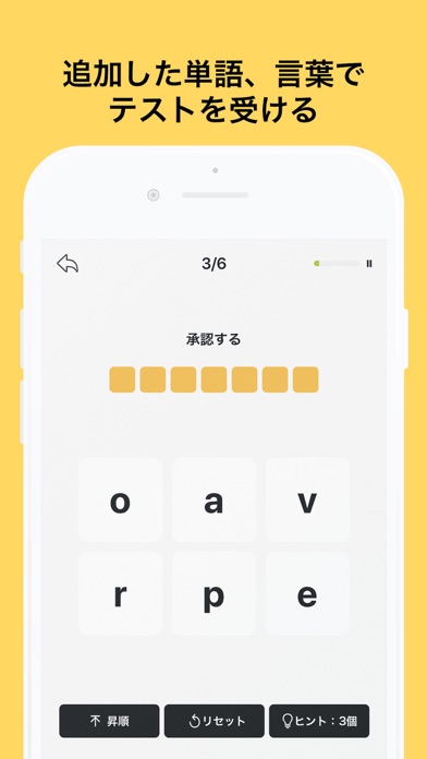


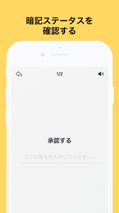
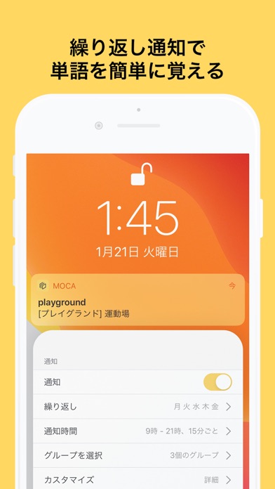
iPad screenshots


Icon palette
About this app
Mocaは単語や会話パターンを勉強している方が簡単に勉強したり、テストを受けたりするために開発した単語帳です。 自分のiCloud Driveにデータを同期し、他のデバイスにも勉強できます。 簡単なインターフェースでより早く世界中の言語の単語や言葉が追加できます。 Excelや他のスプレッドシートアプリでCSVを作成したら一遍に読み込むことができます。 テストを受けたら経験値がもらえます。スロットを購入しなくても、レベルアップしたら無料のスロットを手に入れることができます。 ※レベル40に達成したあと、スロット報酬は約1000個になり、レベル100に達成したあと、約6300個になります。 頑張ってレベルアップして単語を覚えましょう! ********** ・以前無制限のスロットを購入した方、購入画面で右上の購入復元ボタンをタップしてください。 ・スロットを購入してもスロットが追加されない場合、アプリの設定メニューで「開発者にメールを送る」をタップしてメールに送ってください。 ・エラーが発生した場合、メールを送っていただけます。 メール:…
App details
What you can learn from Moca - 自分で作るAI単語帳
Every shipping app on the App Store has gone through the same decisions you're working through right now: which screenshot goes first, what caption sits over it, which device frame to show, what color the background should be. The 13 screenshots above are Moca - 自分で作るAI単語帳's answers to those questions — they're public, they're real, and they made it through Apple's review.
What the numbers say: Moca - 自分で作るAI単語帳 runs a light set where the background shifts from screenshot to screenshot (first shot #E4E4EC) — each image has to stand on its own, so the captions carry more of the story. The accent colour we picked up, #FCD46C, is the one to reuse for badges, arrows and highlighted words if you borrow this look. Hit Use this style to open the editor with these exact colours and drop your own screenshot in.
Notice the first screenshot in particular. It's the one users see in search results and on the product page, and it's where most apps spend their best caption and tightest design. Look at the proportion of background to phone, where the text sits, what one thing the image is trying to communicate.
Want to see how other Education apps approach the same problem? Browse more Education apps in the showcase.
Take what works into your own screenshots
Open LaunchShots and design your App Store & Google Play screenshots — pick a device frame, drop captions, ship in minutes. Free, in your browser.
Open the screenshot editor →Apps with a similar look
Closest background + accent colours among the listings we've analysed — useful when you want to see the same palette handled by a different team.