Chart position — tracked daily by LaunchShots
Screenshot style breakdown
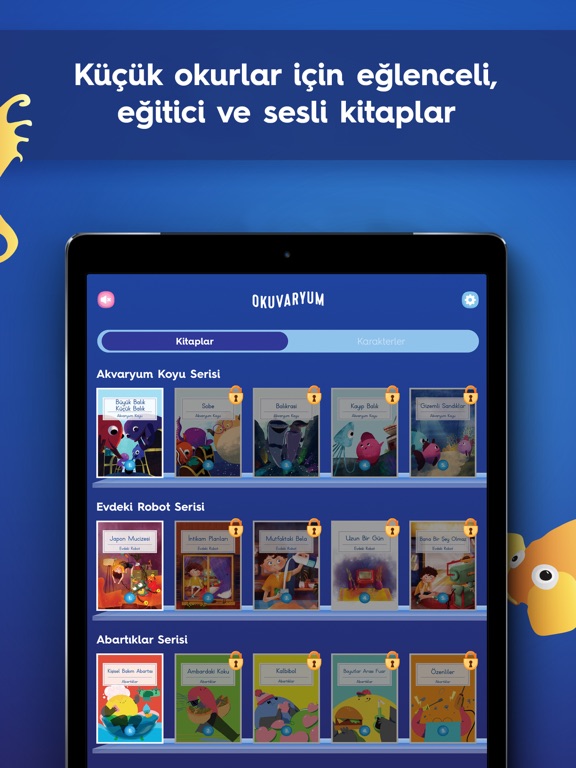
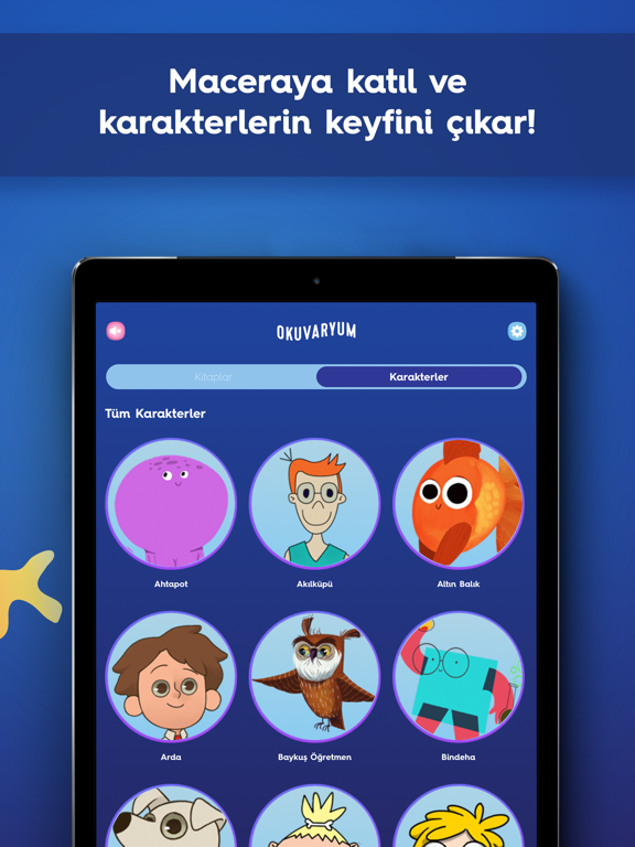
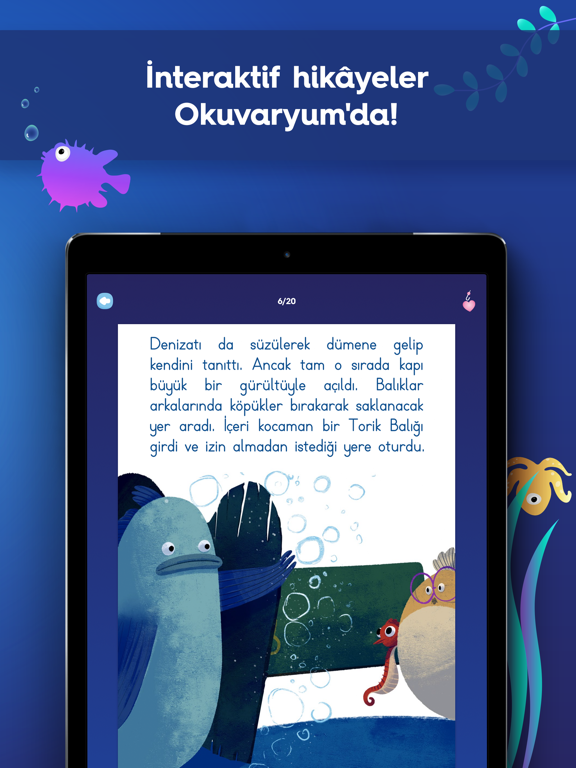
Sampled from 4 of Okuvaryum - Sesli Kitaplar's App Store screenshots — background, accent and theme, measured by LaunchShots (not something Apple publishes).
#1C449C bg
#3B5EA9
#5CACAC accent
#FFFFFF text
Reading the caption text from the screenshots in your browser…
Screenshots
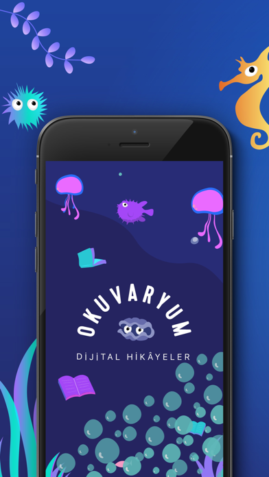

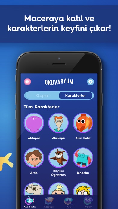
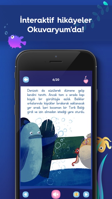
iPad screenshots
Icon palette
About this app
Okuvaryum, çocuklar için tasarlanmış Türkçe dijital hikâye platformudur. Okuvaryum kütüphanesinde sesli, yazılı, eğitici ve eğlenceli yüzlerce çocuk kitabı bulunmaktadır ve bu kitaplara her hafta yenileri eklenerek güncellenmektedir. Okuvaryum hikâyeleri çocukların okuma, anlama, dinleme ve sosyal becerilerini geliştiren; okul ve aile içi eğitime de destek olacak şekilde “çocuğa görelik ilkesi” göz önünde bulundurularak hazırlanmıştır. Bu hedefler temelinde Yapı Kredi Yayınlarının sevilen kitaplarından oluşan bir seçki de Okuvaryum kütüphanesine eklenmiştir. Tüm kitaplar profesyonel seslendirme sanatçıları tarafından seslendirilmiştir. Okuvaryum’daki kitaplar, özgün karakterleri ve renkli görselleri ile çocukların hem ilgili hem de aktif okuyucular olmalarını desteklemektedir. Çocuğunuz; • Sevdiği karakterlerin maceralarını, içinde olduğu diğer hikâyelerden takip edebilir. • Kitapl…
App details
What you can learn from Okuvaryum - Sesli Kitaplar
Every shipping app on the App Store has gone through the same decisions you're working through right now: which screenshot goes first, what caption sits over it, which device frame to show, what color the background should be. The 8 screenshots above are Okuvaryum - Sesli Kitaplar's answers to those questions — they're public, they're real, and they made it through Apple's review.
What the numbers say: Okuvaryum - Sesli Kitaplar runs a dark set with one background colour (#1C449C) carried across every screenshot — the listing reads as a single poster when the shots sit side by side in search results. The accent colour we picked up, #5CACAC, is the one to reuse for badges, arrows and highlighted words if you borrow this look. Hit Use this style to open the editor with these exact colours and drop your own screenshot in.
Notice the first screenshot in particular. It's the one users see in search results and on the product page, and it's where most apps spend their best caption and tightest design. Look at the proportion of background to phone, where the text sits, what one thing the image is trying to communicate.
Want to see how other Book apps approach the same problem? Browse more Book apps in the showcase.
Take what works into your own screenshots
Open LaunchShots and design your App Store & Google Play screenshots — pick a device frame, drop captions, ship in minutes. Free, in your browser.
Open the screenshot editor →Apps with a similar look
Closest background + accent colours among the listings we've analysed — useful when you want to see the same palette handled by a different team.