Chart position — tracked daily by LaunchShots
Screenshot style breakdown
Sampled from 6 of Smart Park's App Store screenshots — background, accent and theme, measured by LaunchShots (not something Apple publishes).
#FCF4EC bg
#DDD6CF
#FC5C04 accent
#111111 text
Screenshots



Icon palette
About this app
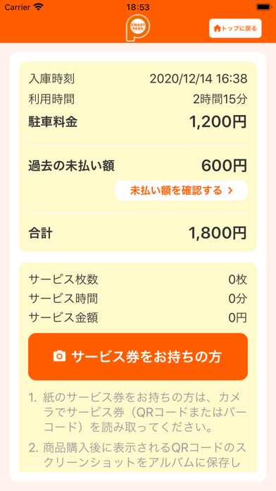
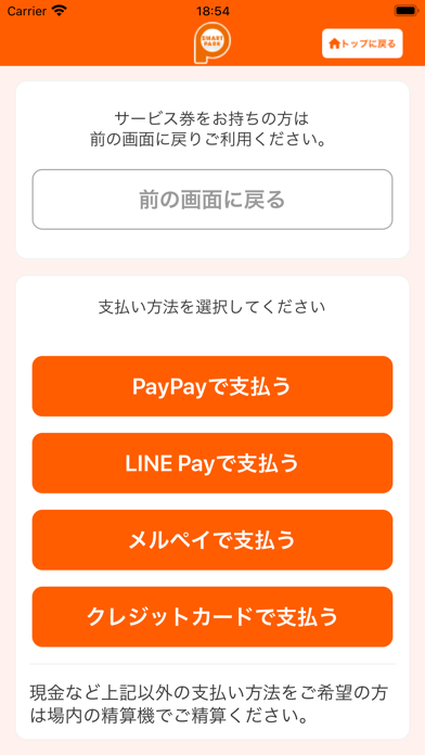
【バージョンアップ時にログアウトしてしまう問題があったことのお詫び】 3.13.0以前のバージョンをご利用のお客様が8月19日リリースのバージョン4.0.1以降に初めてバージョンアップする際、自動的にログアウトしてしまう問題がありました。ご不便をおかけしてしまい大変申し訳ありませんでした。 お手数をおかけしますが、再度ログインして頂くことでまた全ての機能がご利用可能になります。 今後ともご愛顧のほどよろしくお願い申し上げます。 【スマートパーク精算アプリとは】 「スマートパーク」システムの設置された駐車場において、精算機を操作せずにスマートフォンから駐車料金の精算(サービス適用、料金支払い)ができます。 位置情報の使用により、駐車場や店舗・施設近辺のみでご利用可能です。 【本アプリの特長】 ■利用駐車場検知機能 スマートフォンの位置情報から、ご利用の駐車場を簡単に探せます。 ■車両ナンバーと入庫時刻による検索機能 駐車場内の精算機と同様の操作で、駐車したお車のナンバープレートの4桁を入力すると、候補車両の画像…
App details
What you can learn from Smart Park
Every shipping app on the App Store has gone through the same decisions you're working through right now: which screenshot goes first, what caption sits over it, which device frame to show, what color the background should be. The 8 screenshots above are Smart Park's answers to those questions — they're public, they're real, and they made it through Apple's review.
What the numbers say: Smart Park runs a light set with one background colour (#FCF4EC) carried across every screenshot — the listing reads as a single poster when the shots sit side by side in search results. The accent colour we picked up, #FC5C04, is the one to reuse for badges, arrows and highlighted words if you borrow this look. Hit Use this style to open the editor with these exact colours and drop your own screenshot in.
Notice the first screenshot in particular. It's the one users see in search results and on the product page, and it's where most apps spend their best caption and tightest design. Look at the proportion of background to phone, where the text sits, what one thing the image is trying to communicate.
Want to see how other Navigation apps approach the same problem? Browse more Navigation apps in the showcase.
Take what works into your own screenshots
Open LaunchShots and design your App Store & Google Play screenshots — pick a device frame, drop captions, ship in minutes. Free, in your browser.
Open the screenshot editor →Apps with a similar look
Closest background + accent colours among the listings we've analysed — useful when you want to see the same palette handled by a different team.