Chart position — tracked daily by LaunchShots
Screenshot style breakdown
Sampled from 3 of Teddy Eddie Playground's App Store screenshots — background, accent and theme, measured by LaunchShots (not something Apple publishes).
#7CCCC4 bg
#6DB3AC
#8C9C34 accent
#111111 text
Reading the caption text from the screenshots in your browser…
Screenshots
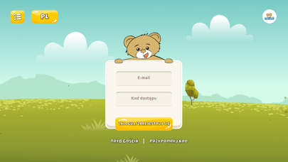
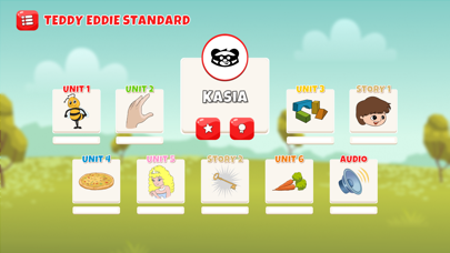

iPad screenshots


Icon palette
About this app
Witamy na Placu Zabaw Teddy Eddie. Nasz Plac Zabaw to baza edukacyjnych gier wspierających naukę języka angielskiego. Wszystkie dzieci w wieku 2-7 lat uczące się metodą Teddy Eddie w dowolnym akredytowanym centrum metody mają zapewniony dostęp do naszej aplikacji, zwanej Plac Zabaw (ang. Playground). Aplikacja zapewnia dostęp do prawdziwego bogactwa interaktywnych gier językowych, które są znakomitym uzupełnieniem kursu językowego prowadzonego metodą Teddy Eddie. Dzięki nim dzieci zyskują dodatkową możliwość powtarzania i utrwalania materiału przerabianego na zajęciach, a nawet go poszerzają. Zabawne animacje motywują dzieci do przechodzenia kolejnych poziomów, a intuicyjność aplikacji pozwala małym uczniom zanurzyć się w świecie misiowych gier. Aby korzystać z wszystkich dostępnych gier zaloguj się przy pomocy PINU, który otrzymasz od akredytowanego centrum metody Teddy Eddie, w k…
App details
What you can learn from Teddy Eddie Playground
Every shipping app on the App Store has gone through the same decisions you're working through right now: which screenshot goes first, what caption sits over it, which device frame to show, what color the background should be. The 6 screenshots above are Teddy Eddie Playground's answers to those questions — they're public, they're real, and they made it through Apple's review.
What the numbers say: Teddy Eddie Playground runs a light set where the background shifts from screenshot to screenshot (first shot #7CCCC4) — each image has to stand on its own, so the captions carry more of the story. The accent colour we picked up, #8C9C34, is the one to reuse for badges, arrows and highlighted words if you borrow this look. Hit Use this style to open the editor with these exact colours and drop your own screenshot in.
Notice the first screenshot in particular. It's the one users see in search results and on the product page, and it's where most apps spend their best caption and tightest design. Look at the proportion of background to phone, where the text sits, what one thing the image is trying to communicate.
Want to see how other Education apps approach the same problem? Browse more Education apps in the showcase.
Take what works into your own screenshots
Open LaunchShots and design your App Store & Google Play screenshots — pick a device frame, drop captions, ship in minutes. Free, in your browser.
Open the screenshot editor →Apps with a similar look
Closest background + accent colours among the listings we've analysed — useful when you want to see the same palette handled by a different team.