Chart position — tracked daily by LaunchShots
Screenshot style breakdown
Sampled from 6 of SmartLMS - Bình dân học vụ số's App Store screenshots — background, accent and theme, measured by LaunchShots (not something Apple publishes).
#ECF4F4 bg
#CFD6D6
#DC2C2C accent
#111111 text
Reading the caption text from the screenshots in your browser…
Screenshots

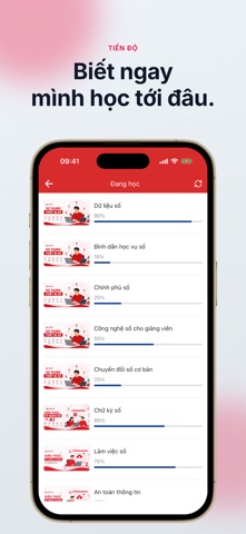

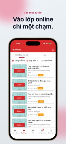
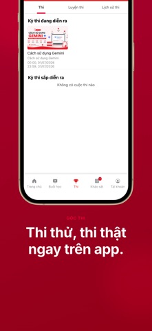
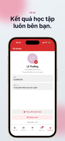

iPad screenshots

Icon palette
About this app
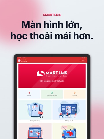
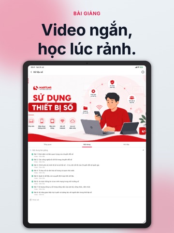
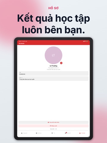
SmartLMS là ứng dụng học tập dành cho học viên của các cơ quan, doanh nghiệp và cơ sở đào tạo đang dùng nền tảng SmartLMS. Toàn bộ khoá học, buổi học trực tuyến, kỳ thi và khảo sát mà đơn vị giao cho bạn đều nằm ở một chỗ. BIẾT NGAY MÌNH ĐANG Ở ĐÂU Màn hình chính tổng hợp số khoá đang học, đã hoàn thành và chưa đạt. Mỗi khoá hiển thị phần trăm tiến độ, mỗi bài học đánh dấu rõ đã xong hay chưa, kèm thời lượng để bạn sắp xếp thời gian. BÀI GIẢNG CHIA NHỎ, DỄ THEO Nội dung khoá học chia theo từng bài với video, tài liệu và bài tập. Mỗi khoá có phần Tổng quan để nắm yêu cầu, phần Nội dung để học và phần Hỏi đáp để trao đổi với giảng viên cùng học viên khác. VÀO LỚP TRỰC TUYẾN CHỈ BẰNG MỘT CHẠM Lịch các buổi học hiển thị theo trạng thái đang diễn ra, sắp diễn ra và đã kết thúc, kèm đếm ngược tới giờ vào lớp. Buổi học trực tuyến mở thẳng phòng Zoom hoặc Webex từ trong ứng dụng; buổi học tr…
App details
What you can learn from SmartLMS - Bình dân học vụ số
Every shipping app on the App Store has gone through the same decisions you're working through right now: which screenshot goes first, what caption sits over it, which device frame to show, what color the background should be. The 11 screenshots above are SmartLMS - Bình dân học vụ số's answers to those questions — they're public, they're real, and they made it through Apple's review.
What the numbers say: SmartLMS - Bình dân học vụ số runs a mixed light-and-dark set where the background shifts from screenshot to screenshot (first shot #ECF4F4) — each image has to stand on its own, so the captions carry more of the story. The accent colour we picked up, #DC2C2C, is the one to reuse for badges, arrows and highlighted words if you borrow this look. Hit Use this style to open the editor with these exact colours and drop your own screenshot in.
Notice the first screenshot in particular. It's the one users see in search results and on the product page, and it's where most apps spend their best caption and tightest design. Look at the proportion of background to phone, where the text sits, what one thing the image is trying to communicate.
Want to see how other Education apps approach the same problem? Browse more Education apps in the showcase.
Take what works into your own screenshots
Open LaunchShots and design your App Store & Google Play screenshots — pick a device frame, drop captions, ship in minutes. Free, in your browser.
Open the screenshot editor →Apps with a similar look
Closest background + accent colours among the listings we've analysed — useful when you want to see the same palette handled by a different team.