Chart position — tracked daily by LaunchShots
Screenshot style breakdown
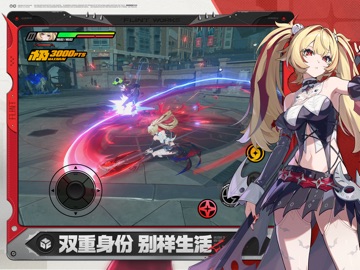
Sampled from 5 of 绝区零's App Store screenshots — background, accent and theme, measured by LaunchShots (not something Apple publishes).
#040404 bg
#272727
#7C4C44 accent
#FFFFFF text
Screenshots


iPad screenshots



Icon palette
About this app
不要进入空洞。 我知道我知道,空洞里有以太资源、有异化造物、甚至有旧文明的遗产,全都是珍贵的财富。 但是别忘了,那里面空间紊乱,怪物肆虐,异变横生,终究是一场吞没世界的灾难,不是一般人该去的地方。 所以不要进入空洞。 至少,不要“独自”进入空洞。 如果你执意要进入险境,那先去新艾利都吧。 那座鱼龙混杂的都市里有许多对空洞有需求的人:权势遮天的财阀、蛰伏街头的帮派、暗藏阴谋的狂人或者铁面无情的官吏。 在那里做好完全的准备,结交有实力的同伴,以及最重要的—— 找到一位“绳匠”。 只有他们有能力把人从迷宫般的空洞里引导出来。 祝你好运。 《绝区零》是米哈游自研的全新都市动作冒险游戏,故事发生在被神秘的超自然灾害「空洞」所侵袭的近未来。 双重身份,别样生活 故事发生在被神秘的超自然灾害「空洞」所侵袭的近未来。在这灾祸频仍的世界里,崛起了一座另类的城市——「新艾利都」。这座最后的「绿洲」掌握了与「空洞」共生的技术,盘踞着错综复杂的势力,它混乱、喧嚣、危险又充满活力。而你将成为串联起空洞与都市的关键少数派,名为「绳匠…
App details
What you can learn from 绝区零
Every shipping app on the App Store has gone through the same decisions you're working through right now: which screenshot goes first, what caption sits over it, which device frame to show, what color the background should be. The 10 screenshots above are 绝区零's answers to those questions — they're public, they're real, and they made it through Apple's review.
What the numbers say: 绝区零 runs a mixed light-and-dark set where the background shifts from screenshot to screenshot (first shot #040404) — each image has to stand on its own, so the captions carry more of the story. The accent colour we picked up, #7C4C44, is the one to reuse for badges, arrows and highlighted words if you borrow this look. Hit Use this style to open the editor with these exact colours and drop your own screenshot in.
Notice the first screenshot in particular. It's the one users see in search results and on the product page, and it's where most apps spend their best caption and tightest design. Look at the proportion of background to phone, where the text sits, what one thing the image is trying to communicate.
Want to see how other Games apps approach the same problem? Browse more Games apps in the showcase.
Take what works into your own screenshots
Open LaunchShots and design your App Store & Google Play screenshots — pick a device frame, drop captions, ship in minutes. Free, in your browser.
Open the screenshot editor →Apps with a similar look
Closest background + accent colours among the listings we've analysed — useful when you want to see the same palette handled by a different team.