Screenshots

Icon palette
About this app
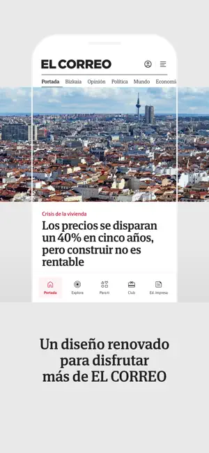
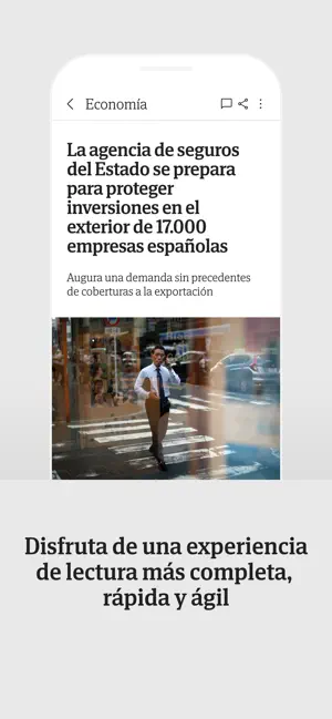
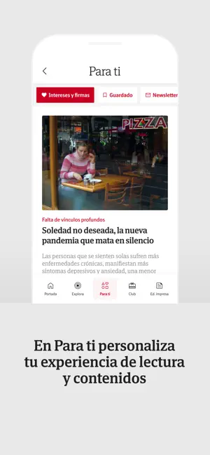
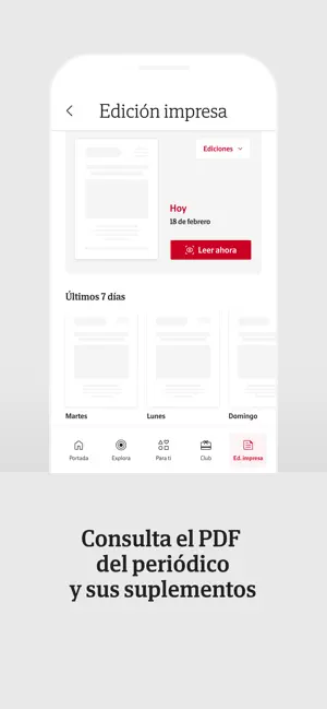
Nuevo diseño, nuevos contenidos, nuevas funcionalidades y mayor rendimiento. Hemos renovado la app de EL CORREO por completo, para que tengas la mejor experiencia, desde cualquier lugar y en cualquier momento, con la calidad de siempre. · Un diseño renovado enfocado en mejorar tu experiencia. · Navega por las principales secciones directamente desde la portada, simplemente deslizando a la derecha. · Descubre Explora, la nueva sección audiovisual con vídeos, narrativas especiales y explicativos. · En Para ti podrás elegir tus temas y autores favoritos para crear una página 100% personalizada. · Ahora puedes consultar el PDF de los periódicos de los últimos 7 días y los suplementos. Una nueva funcionalidad disponible para los suscriptores Premium. · Participa en el Club y disfruta de sorteos, experiencias y descuentos exclusivos para suscriptores. · Personaliza las notificaciones de tus…
App details
What you can learn from El Correo
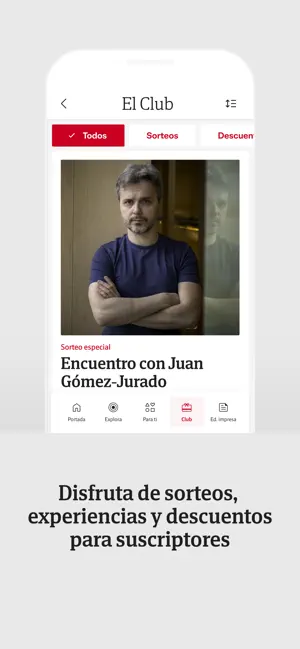
Every shipping app on the App Store has gone through the same decisions you're working through right now: which screenshot goes first, what caption sits over it, which device frame to show, what color the background should be. The 6 screenshots above are El Correo's answers to those questions — they're public, they're real, and they made it through Apple's review.
Notice the first screenshot in particular. It's the one users see in search results and on the product page, and it's where most apps spend their best caption and tightest design. Look at the proportion of background to phone, where the text sits, what one thing the image is trying to communicate.
Want to see how other News apps approach the same problem? Browse more News apps in the showcase.
Take what works into your own screenshots
Open LaunchShots and design your App Store & Google Play screenshots — pick a device frame, drop captions, ship in minutes. Free, in your browser.
Open the screenshot editor →