Chart position — tracked daily by LaunchShots
Screenshot style breakdown
Sampled from 6 of Sud Ouest : l'info en continu's App Store screenshots — background, accent and theme, measured by LaunchShots (not something Apple publishes).
#D42C1C bg
#DA493B
#1C6414 accent
#FFFFFF text
- #1pur Bonne humeur Déclic Tourisme Faits di
- #2Explorez nos thématiques < Que recherchez-vous ?
- #3? à [ L'actualité autour de vous
- #4Swipez et découvrez nos top articles 9:41 "=
- #5Optimisez votre confort de lecture La Rochelle Agglo : six bonnes
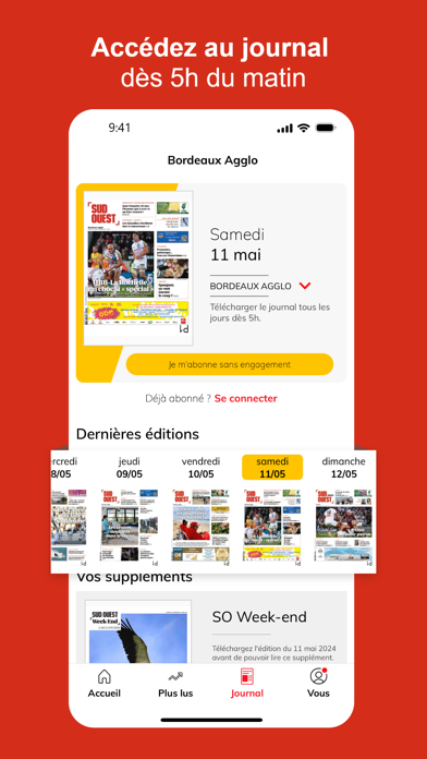
- #6Bordeaux Agglo
Captions read from the screenshots (OCR, may contain small errors): 6 headlines, 7 words on average (longest 11).
Screenshots



iPad screenshots


Icon palette
About this app
Sud Ouest – L'info régionale de proximité, votre quotidien de confiance en temps réel, partout avec vous Téléchargez l'application officielle Sud Ouest et plongez au cœur de l'information de votre région. Que vous soyez en Gironde, Charente, Charente-Maritime, Dordogne, Landes, Lot-et-Garonne, ou Pyrénées-Atlantiques, nous vous offrons une couverture complète et ultra-locale, portée par les valeurs qui font notre force depuis toujours : la proximité, la confiance et l'indépendance éditoriale, où que vous soyez. Pourquoi choisir l'application Sud Ouest ? 1. Proximité : L'Info au plus Près de Chez Vous Notre réseau de plus de 220 journalistes, reporters et correspondants basés au cœur des territoires, travaillent chaque jour pour vous apporter une information fiable, contextualisée et vérifiée. s'étend sur toute la Nouvelle-Aquitaine. Avec Sud Ouest, vous ne manquez rien de ce qui comp…
App details
What you can learn from Sud Ouest : l'info en continu
Every shipping app on the App Store has gone through the same decisions you're working through right now: which screenshot goes first, what caption sits over it, which device frame to show, what color the background should be. The 14 screenshots above are Sud Ouest : l'info en continu's answers to those questions — they're public, they're real, and they made it through Apple's review.
What the numbers say: Sud Ouest : l'info en continu runs a dark set with one background colour (#D42C1C) carried across every screenshot — the listing reads as a single poster when the shots sit side by side in search results. The accent colour we picked up, #1C6414, is the one to reuse for badges, arrows and highlighted words if you borrow this look. Hit Use this style to open the editor with these exact colours and drop your own screenshot in.
Notice the first screenshot in particular. It's the one users see in search results and on the product page, and it's where most apps spend their best caption and tightest design. Look at the proportion of background to phone, where the text sits, what one thing the image is trying to communicate.
Want to see how other News apps approach the same problem? Browse more News apps in the showcase.
Take what works into your own screenshots
Open LaunchShots and design your App Store & Google Play screenshots — pick a device frame, drop captions, ship in minutes. Free, in your browser.
Open the screenshot editor →Apps with a similar look
Closest background + accent colours among the listings we've analysed — useful when you want to see the same palette handled by a different team.