Chart position — tracked daily by LaunchShots
Screenshot changes — detected by LaunchShots
Screenshot style breakdown
Sampled from 5 of ATB-Market's App Store screenshots — background, accent and theme, measured by LaunchShots (not something Apple publishes).
#B40C0C bg
#BE2E2E
#5CBC74 accent
#FFFFFF text
Screenshots


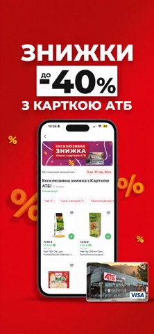

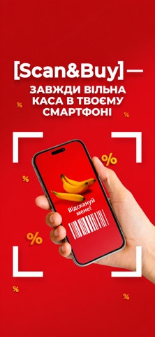
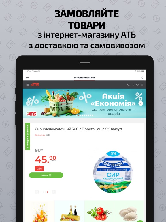
iPad screenshots

Icon palette
About this app
Найбільша мережа продуктових магазинів АТБ тепер у Вашому смартфоні з новим мобільним додатком ATB! Зручні та корисні сервіси для наших улюблених клієнтів: ● Інтернет-магазин АТБ – замовляйте якісні товари за низькими цінами та зручною доставкою за вказаною адресою; ● Акції – отримуйте інформацію про всі акції в мережі АТБ, а це більше 1000 товарів щотижня! «Економія», «Суперціна», «7 днів», «Загальні акції», «Новинки», «Міцні знижки» з можливістю розглянути товар, та додати його в кошик інтернет-магазину, або сформувати список майбутніх покупок; ● Картка АТБ – ваша персональна банківська картка від провідних українських банків – Моно, Райф, А-Банк, Ощад, УкрГаз, Сенс. Отримайте всі переваги – постійні та додаткові знижки на покупки в АТБ від 5% до 40%; ● Мої чеки – ваша історія покупок завжди під рукою, бережіть навколишнє середовище – відмовляйтесь від паперових чеків, то контролюйте …
App details
What you can learn from ATB-Market
Every shipping app on the App Store has gone through the same decisions you're working through right now: which screenshot goes first, what caption sits over it, which device frame to show, what color the background should be. The 7 screenshots above are ATB-Market's answers to those questions — they're public, they're real, and they made it through Apple's review.
What the numbers say: ATB-Market runs a dark set with one background colour (#B40C0C) carried across every screenshot — the listing reads as a single poster when the shots sit side by side in search results. The accent colour we picked up, #5CBC74, is the one to reuse for badges, arrows and highlighted words if you borrow this look. Hit Use this style to open the editor with these exact colours and drop your own screenshot in.
Notice the first screenshot in particular. It's the one users see in search results and on the product page, and it's where most apps spend their best caption and tightest design. Look at the proportion of background to phone, where the text sits, what one thing the image is trying to communicate.
Want to see how other Lifestyle apps approach the same problem? Browse more Lifestyle apps in the showcase.
Take what works into your own screenshots
Open LaunchShots and design your App Store & Google Play screenshots — pick a device frame, drop captions, ship in minutes. Free, in your browser.
Open the screenshot editor →Apps with a similar look
Closest background + accent colours among the listings we've analysed — useful when you want to see the same palette handled by a different team.