Chart position — tracked daily by LaunchShots
Screenshot changes — detected by LaunchShots
Screenshot style breakdown
Sampled from 6 of Tatilsepeti - Otel, Uçak, Tur's App Store screenshots — background, accent and theme, measured by LaunchShots (not something Apple publishes).
#94D4EC bg
#82BACF
#043464 accent
#111111 text
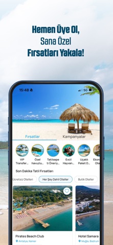
- #1Türkiye'nin ilk Akıllı Tatil Platformu Tatilsepeti
- #3Yurt igi Otellerde Benzersiz Fırsatlarla Rezervasyonunu Tamamla!
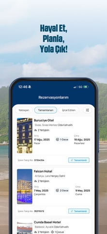
- #4Yurt igi ve Yurt Dışı Tur Seçeneklerini Hemen İncele!
- #5Sayısız Tatil Seçeneği Arasında Sana En Uygun Olanı Bul!
Captions read from the screenshots (OCR, may contain small errors): 4 headlines, 7.8 words on average (longest 9).
Screenshots


Icon palette
About this app
Hayalinizdeki tatili planlamak tatilsepeti ile çok kolay! Seyahat uygulamamız ile tatil planı, otel rezervasyonu, tur satın alma, uçak bileti, araç kiralama, tekne kiralama ve transfer hizmetlerine tek bir platformdan hızlı ve güvenli bir şekilde erişebilirsiniz. Tüm seyahat ihtiyaçlarınızı ayrı ayrı sitelerde arayarak kaybolmak yerine, tatilinizi tek bir mobil uygulama üzerinden uçtan uca planlayın! Seyahatinizi Tek Bir Uygulama ile Planlayın Tatil planlamanın tüm adımlarını tek bir uygulamada birleştiren tatilsepeti mobil uygulamamız sayesinde; otel rezervasyonu, online uçak bileti, tekne kiralama, araç kiralama, gemi cruis turları ve transfer hizmetlerinin tamamına hızlı ve kolay bir şekilde ulaşabilirsiniz. Böylece birkaç farklı uygulama ya da site arasında gezinerek zaman kaybetmeden, seyahatinizin her detayını tek ekrandan yönetebilirsiniz. Bütçe ve beklentilerinize en uygun tat…
App details
What you can learn from Tatilsepeti - Otel, Uçak, Tur
Every shipping app on the App Store has gone through the same decisions you're working through right now: which screenshot goes first, what caption sits over it, which device frame to show, what color the background should be. The 7 screenshots above are Tatilsepeti - Otel, Uçak, Tur's answers to those questions — they're public, they're real, and they made it through Apple's review.
What the numbers say: Tatilsepeti - Otel, Uçak, Tur runs a light set where the background shifts from screenshot to screenshot (first shot #94D4EC) — each image has to stand on its own, so the captions carry more of the story. The accent colour we picked up, #043464, is the one to reuse for badges, arrows and highlighted words if you borrow this look. Hit Use this style to open the editor with these exact colours and drop your own screenshot in.
Notice the first screenshot in particular. It's the one users see in search results and on the product page, and it's where most apps spend their best caption and tightest design. Look at the proportion of background to phone, where the text sits, what one thing the image is trying to communicate.
Want to see how other Travel apps approach the same problem? Browse more Travel apps in the showcase.
Take what works into your own screenshots
Open LaunchShots and design your App Store & Google Play screenshots — pick a device frame, drop captions, ship in minutes. Free, in your browser.
Open the screenshot editor →Apps with a similar look
Closest background + accent colours among the listings we've analysed — useful when you want to see the same palette handled by a different team.