Chart position — tracked daily by LaunchShots
Screenshot changes — detected by LaunchShots
Screenshot style breakdown
Sampled from 6 of Migii TOPIK 1-6 & EPS TOPIK's App Store screenshots — background, accent and theme, measured by LaunchShots (not something Apple publishes).
#D4FCFC bg
#BADDDD
#04BCB4 accent
#111111 text
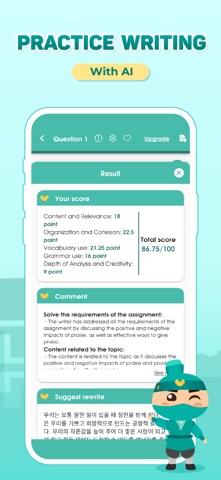
- #2Target: 6 scores
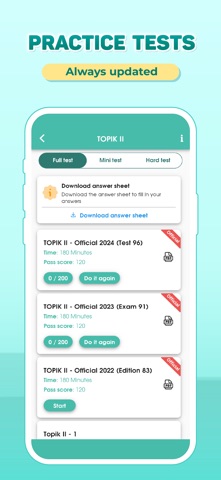
- #3TOPIK Il - Official 2022 (Edition 83) A Time: 180 Minutes
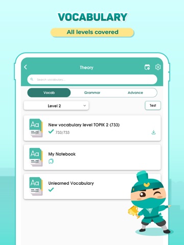
- #4Unlearned Vocabulary
- #5Part 4 - Matching sentence be Correct 119 Part 5 - Focused thinking
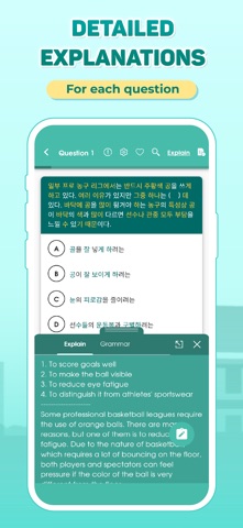
- #61. To score goals well 2. To make the ball visible i 3. ไอ reduce eye fatigue
Captions read from the screenshots (OCR, may contain small errors): 5 headlines, 9.2 words on average (longest 17).
Screenshots




iPad screenshots




Icon palette
About this app
Integrate 2 exams in one application, Migii TOPIK provides you with all the necessary knowledge to confidently conquer the TOPIK and EPS TOPIK. 1. Improve your Korean grammar and vocabulary for TOPIK and EPS TOPIK - Comprehensive set of Korean grammar and vocabulary that appears in the TOPIK and EPS TOPIK exams - Advanced vocabulary list with a variety of topics and difficulty levels: Sejong vocabulary 1-6, communication vocabulary, specialized vocabulary, etc. - Easy memorization with practice exercises and flashcards 2. Intensive practice for each skills - Focus on improving your weaknesses in each section: listening, reading, writing - Practice listening effectively with subtitles and transcripts - Challenge yourself with the TOPIK speaking test - Comprehensive and detailed instructions for the TOPIK writing test 3. Mock tests like the real exam, receive certificates and answers a…
App details
What you can learn from Migii TOPIK 1-6 & EPS TOPIK
Every shipping app on the App Store has gone through the same decisions you're working through right now: which screenshot goes first, what caption sits over it, which device frame to show, what color the background should be. The 14 screenshots above are Migii TOPIK 1-6 & EPS TOPIK's answers to those questions — they're public, they're real, and they made it through Apple's review.
What the numbers say: Migii TOPIK 1-6 & EPS TOPIK runs a light set with one background colour (#D4FCFC) carried across every screenshot — the listing reads as a single poster when the shots sit side by side in search results. The accent colour we picked up, #04BCB4, is the one to reuse for badges, arrows and highlighted words if you borrow this look. Hit Use this style to open the editor with these exact colours and drop your own screenshot in.
Notice the first screenshot in particular. It's the one users see in search results and on the product page, and it's where most apps spend their best caption and tightest design. Look at the proportion of background to phone, where the text sits, what one thing the image is trying to communicate.
Want to see how other Education apps approach the same problem? Browse more Education apps in the showcase.
Take what works into your own screenshots
Open LaunchShots and design your App Store & Google Play screenshots — pick a device frame, drop captions, ship in minutes. Free, in your browser.
Open the screenshot editor →Apps with a similar look
Closest background + accent colours among the listings we've analysed — useful when you want to see the same palette handled by a different team.