Chart position — tracked daily by LaunchShots
Screenshot changes — detected by LaunchShots
Screenshot style breakdown
Sampled from 6 of 福岡銀行アプリ's App Store screenshots — background, accent and theme, measured by LaunchShots (not something Apple publishes).
#F4F4FC bg
#D6D6DD
#2CACDC accent
#111111 text
Screenshots




Icon palette
About this app
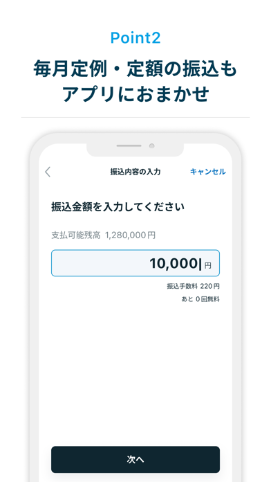
おトクで便利な会員制サービス「バリープログラム」はお取引状況に応じて特典がアップ、例えばプレミアムコースの方なら、他行宛振込手数料が最大月3回無料、コンビニATM手数料永年無料など、いつもの銀行取引がもっと便利に! さらに「バリーカード」のポイントアップ対象店でのご利用で最大20%のポイントが貯まるなど、いつもの暮らしがもっとおトクに! さっそくアプリを登録して、バリープログラムとバリーカードを申し込みましょう! 福岡銀行(ふくぎん)の公式アプリです。 残高照会や入出金明細、振込といった基本機能を中心に、福岡銀行で総合口座をお持ちの方であれば誰でもカンタンかつ安心・安全に利用できます。 福岡銀行に口座をお持ちでない方は本アプリからお申込ができます。 ■7つのポイント POINT 1:いつでもカンタンに残高や明細をチェック 残高や入出金明細はホーム画面からすぐに確認できます。アプリ登録以降、明細はずっと保存。絞り込み検索やメモ機能で通帳よりも便利に。 POINT 2:毎月定例・定額の振込もアプリにおまかせ 振込は簡単…
App details
What you can learn from 福岡銀行アプリ
Every shipping app on the App Store has gone through the same decisions you're working through right now: which screenshot goes first, what caption sits over it, which device frame to show, what color the background should be. The 8 screenshots above are 福岡銀行アプリ's answers to those questions — they're public, they're real, and they made it through Apple's review.
What the numbers say: 福岡銀行アプリ runs a light set with one background colour (#F4F4FC) carried across every screenshot — the listing reads as a single poster when the shots sit side by side in search results. The accent colour we picked up, #2CACDC, is the one to reuse for badges, arrows and highlighted words if you borrow this look. Hit Use this style to open the editor with these exact colours and drop your own screenshot in.
Notice the first screenshot in particular. It's the one users see in search results and on the product page, and it's where most apps spend their best caption and tightest design. Look at the proportion of background to phone, where the text sits, what one thing the image is trying to communicate.
Want to see how other Finance apps approach the same problem? Browse more Finance apps in the showcase.
Take what works into your own screenshots
Open LaunchShots and design your App Store & Google Play screenshots — pick a device frame, drop captions, ship in minutes. Free, in your browser.
Open the screenshot editor →Apps with a similar look
Closest background + accent colours among the listings we've analysed — useful when you want to see the same palette handled by a different team.