Screenshot style breakdown
Sampled from 6 of Mojo Education's App Store screenshots — background, accent and theme, measured by LaunchShots (not something Apple publishes).
#4CC4AC bg
#42AC97
#2C4C6C accent
#111111 text
Screenshots




Icon palette
About this app
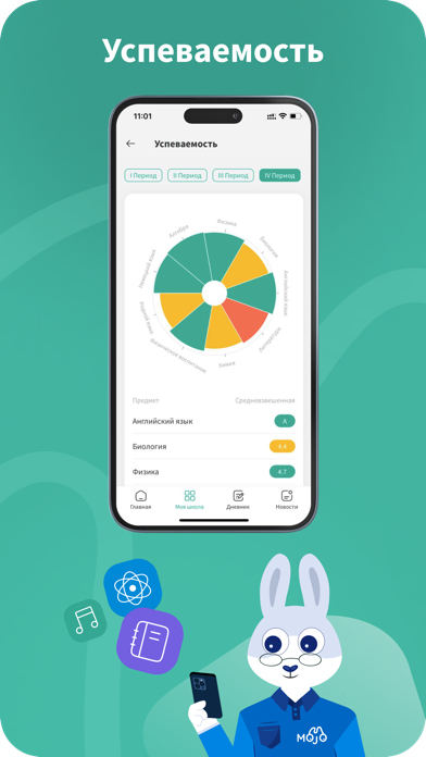
Mojo – интернет-сервис управления инновационной школой Mojo – вся школа в вашем кармане. Mojo – решение для обеспечения прозрачности образовательного процесса и платформа для взаимодействия родителей, учеников и учителей. Приложение предоставляет образовательным учреждениям эффективный инструмент управления всеми повседневными задачами. Ключевые возможности приложения: Для родителей и учащихся: Расписание уроков, кружков и дополнительных занятиях, уведомление о всех изменениях в режиме online Домашние задания и планы занятий Оценки и посещаемость Новости вашей школы: информация о предстоящих событиях Для учителей: Расписание уроков и внеклассных активностей, включая дежурства, дополнительные и кружки Интерактивный электронный журнал: ввод и обновление оценок учеников, отметки посещаемости в пару касаний, внесение всей информации об уроке в едином пространстве Статистика успеваемост…
App details
What you can learn from Mojo Education
Every shipping app on the App Store has gone through the same decisions you're working through right now: which screenshot goes first, what caption sits over it, which device frame to show, what color the background should be. The 7 screenshots above are Mojo Education's answers to those questions — they're public, they're real, and they made it through Apple's review.
What the numbers say: Mojo Education runs a light set with one background colour (#4CC4AC) carried across every screenshot — the listing reads as a single poster when the shots sit side by side in search results. The accent colour we picked up, #2C4C6C, is the one to reuse for badges, arrows and highlighted words if you borrow this look. Hit Use this style to open the editor with these exact colours and drop your own screenshot in.
Notice the first screenshot in particular. It's the one users see in search results and on the product page, and it's where most apps spend their best caption and tightest design. Look at the proportion of background to phone, where the text sits, what one thing the image is trying to communicate.
Want to see how other Education apps approach the same problem? Browse more Education apps in the showcase.
Take what works into your own screenshots
Open LaunchShots and design your App Store & Google Play screenshots — pick a device frame, drop captions, ship in minutes. Free, in your browser.
Open the screenshot editor →Apps with a similar look
Closest background + accent colours among the listings we've analysed — useful when you want to see the same palette handled by a different team.