Screenshot style breakdown
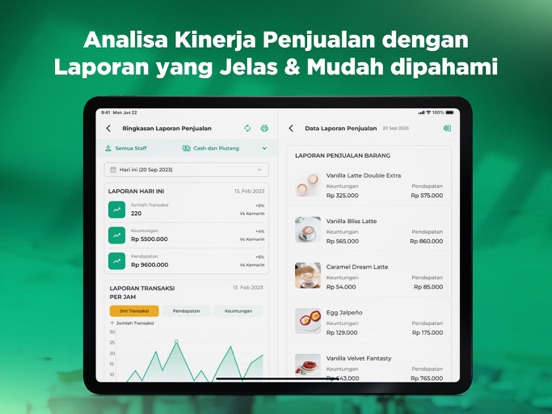
Sampled from 4 of Kasir Pintar Dashboard's App Store screenshots — background, accent and theme, measured by LaunchShots (not something Apple publishes).
#046C44 bg
#27805E
#64D49C accent
#FFFFFF text
- #1Tampilan Baru untuk Pengalaman Pengguna yang
- #2Kontrol Penuh Stok Barang dengan Mudah
- #3Optimalkan Bisnis Anda dengan Aplikasi Kasir Pintar
- #4Tambahkan Barang Baru dalam Hitungan Detik
Captions read from the screenshots (OCR, may contain small errors): 4 headlines, 6.3 words on average (longest 7).
Screenshots


iPad screenshots


Icon palette
About this app
Aplikasi Kasir Pintar Dashboard adalah aplikasi Kasir atau Aplikasi Point of Sales yang dikembangkan untuk para Owner atau Administrator agar dapat membantu memonitor dan mengadministrasi kegiatan usaha mereka. Kasir Pintar Dashboard sesuai dengan tujuannya menyediakan fitur berupa manajemen lengkap (barang, supplier, customer, promosi, dll) serta fitur laporan usaha lengkap. Aplikasi Kasir ini dirancang khusus untuk memenuhi kebutuhan bisnis Anda. Berikut adalah beberapa fitur unggulan yang dapat Anda nikmati: - Laporan Bisnis Real-time: Pantau kinerja bisnis dari aplikasi atau backoffice website. - Laporan Keuangan: Analisis laba rugi, arus keuangan, dan laporan penjualan untuk pengambilan keputusan yang lebih baik. - Manajemen Stok yang Efisien: Kelola stok, pembelian, dan stok opname dengan mudah. - Manajemen Pelanggan & Supplier: Bangun hubungan kuat dengan pelanggan dan kelola …
App details
What you can learn from Kasir Pintar Dashboard
Every shipping app on the App Store has gone through the same decisions you're working through right now: which screenshot goes first, what caption sits over it, which device frame to show, what color the background should be. The 9 screenshots above are Kasir Pintar Dashboard's answers to those questions — they're public, they're real, and they made it through Apple's review.
What the numbers say: Kasir Pintar Dashboard runs a dark set where the background shifts from screenshot to screenshot (first shot #046C44) — each image has to stand on its own, so the captions carry more of the story. The accent colour we picked up, #64D49C, is the one to reuse for badges, arrows and highlighted words if you borrow this look. Hit Use this style to open the editor with these exact colours and drop your own screenshot in.
Notice the first screenshot in particular. It's the one users see in search results and on the product page, and it's where most apps spend their best caption and tightest design. Look at the proportion of background to phone, where the text sits, what one thing the image is trying to communicate.
Want to see how other Business apps approach the same problem? Browse more Business apps in the showcase.
Take what works into your own screenshots
Open LaunchShots and design your App Store & Google Play screenshots — pick a device frame, drop captions, ship in minutes. Free, in your browser.
Open the screenshot editor →Apps with a similar look
Closest background + accent colours among the listings we've analysed — useful when you want to see the same palette handled by a different team.