Chart position — tracked daily by LaunchShots
Screenshot changes — detected by LaunchShots
Screenshot style breakdown
Sampled from 6 of Almost read: Трекер книг's App Store screenshots — background, accent and theme, measured by LaunchShots (not something Apple publishes).
#14140C bg
#34342E
#9CACF4 accent
#FFFFFF text
Reading the caption text from the screenshots in your browser…
Screenshots





Icon palette
About this app
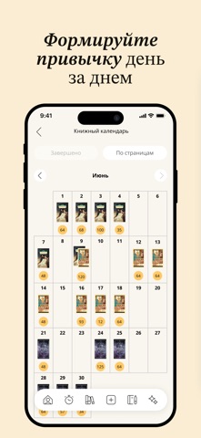
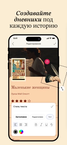
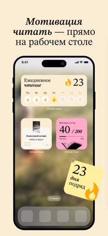
Ищете книжный трекер, который умеет больше, чем просто считать страницы? Almost read — эстетичный трекер книг и читательский дневник для тех, кто осмысливает прочитанное. Отслеживайте каждую книгу на полке, засекайте время чтения таймером, формируйте привычку с сериями дней и получайте ИИ-рекомендации, которые точно попадут в вкус. УПРАВЛЯЙТЕ БИБЛИОТЕКОЙ И СВОИМИ СПИСКАМИ Организуйте библиотеку по полкам: Сейчас читаю, Завершенные и Хочу прочитать. Создавайте кастомные полки по настроению или жанру. Добавляйте книги по штрихкоду, вручную или через импорт из других приложений. Ищите по названию или автору, чтобы быстро пополнять библиотеку. ТАЙМЕР, СЕССИИ И ЦЕЛИ ЧТЕНИЯ Засекайте время для каждой книги с помощью встроенного таймера. Вносите сессии вручную, если нужно догнать статистику. Ставьте цели на год и держите серию дней, чтобы привычка читать не пропадала. Смотрите прогресс на к…
App details
What you can learn from Almost read: Трекер книг
Every shipping app on the App Store has gone through the same decisions you're working through right now: which screenshot goes first, what caption sits over it, which device frame to show, what color the background should be. The 9 screenshots above are Almost read: Трекер книг's answers to those questions — they're public, they're real, and they made it through Apple's review.
What the numbers say: Almost read: Трекер книг runs a mixed light-and-dark set where the background shifts from screenshot to screenshot (first shot #14140C) — each image has to stand on its own, so the captions carry more of the story. The accent colour we picked up, #9CACF4, is the one to reuse for badges, arrows and highlighted words if you borrow this look. Hit Use this style to open the editor with these exact colours and drop your own screenshot in.
Notice the first screenshot in particular. It's the one users see in search results and on the product page, and it's where most apps spend their best caption and tightest design. Look at the proportion of background to phone, where the text sits, what one thing the image is trying to communicate.
Want to see how other Book apps approach the same problem? Browse more Book apps in the showcase.
Take what works into your own screenshots
Open LaunchShots and design your App Store & Google Play screenshots — pick a device frame, drop captions, ship in minutes. Free, in your browser.
Open the screenshot editor →Apps with a similar look
Closest background + accent colours among the listings we've analysed — useful when you want to see the same palette handled by a different team.