Chart position — tracked daily by LaunchShots
Screenshot changes — detected by LaunchShots
Screenshot style breakdown
Sampled from 6 of Вай такси's App Store screenshots — background, accent and theme, measured by LaunchShots (not something Apple publishes).
#B4B4BC bg
#9E9EA5
#ECC474 accent
#111111 text
Screenshots




Icon palette
About this app
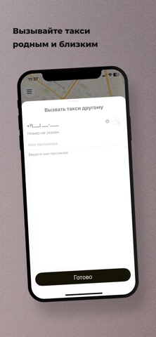
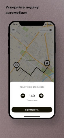
Воспользуйтесь простым и удобным способом заказа такси в Чеченской Республике. С мобильным приложением — "Вай Такси" всегда под рукой. — Закажите такси за пару секунд Откройте приложение, укажите адрес и закажите такси, нажав на одну кнопку. — Снижайте стоимость поездки Воспользуйтесь тарифом «Аукцион» и назначайте свою цену. Снижайте цену, чтобы сэкономить, или повышайте, чтобы ускорить подачу. — Оформите заказ еще быстрее Сохраняйте места, в которых бываете часто. Дом, работа, друзья. Выбирайте из сохраненных вариантов, чтобы не вводить адрес вручную. — Сделайте поездку комфортнее Добавляйте к заказу пожелания, напишите комментарий водителю, ускоряйте поиск автомобиля. — Сократите время ожидания такси Едете на встречу в час-пик и не получается найти машину? Увеличьте стоимость заказа. Так водитель быстрее заберет ваш заказ во время повышенного спроса. — Добавляйте остано…
App details
What you can learn from Вай такси
Every shipping app on the App Store has gone through the same decisions you're working through right now: which screenshot goes first, what caption sits over it, which device frame to show, what color the background should be. The 8 screenshots above are Вай такси's answers to those questions — they're public, they're real, and they made it through Apple's review.
What the numbers say: Вай такси runs a mixed light-and-dark set where the background shifts from screenshot to screenshot (first shot #B4B4BC) — each image has to stand on its own, so the captions carry more of the story. The accent colour we picked up, #ECC474, is the one to reuse for badges, arrows and highlighted words if you borrow this look. Hit Use this style to open the editor with these exact colours and drop your own screenshot in.
Notice the first screenshot in particular. It's the one users see in search results and on the product page, and it's where most apps spend their best caption and tightest design. Look at the proportion of background to phone, where the text sits, what one thing the image is trying to communicate.
Want to see how other Navigation apps approach the same problem? Browse more Navigation apps in the showcase.
Take what works into your own screenshots
Open LaunchShots and design your App Store & Google Play screenshots — pick a device frame, drop captions, ship in minutes. Free, in your browser.
Open the screenshot editor →Apps with a similar look
Closest background + accent colours among the listings we've analysed — useful when you want to see the same palette handled by a different team.