Chart position — tracked daily by LaunchShots
Screenshot style breakdown
Sampled from 5 of Dark War: Survival VN's App Store screenshots — background, accent and theme, measured by LaunchShots (not something Apple publishes).
#444C54 bg
#5E656B
#F4D474 accent
#FFFFFF text
Screenshots
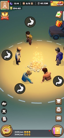

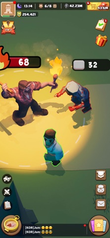


iPad screenshots

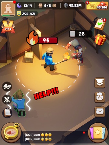


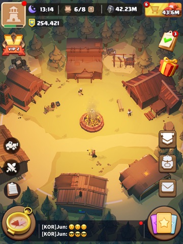
Icon palette
About this app
Trang bị và sẵn sàng cho thử thách cuối cùng trong cuộc sống sót sau tận thế zombie! Hòa mình vào lối chơi hấp dẫn và khám phá những sự kiện lôi cuốn đang chờ đón bạn! Khi một loại virus zombie đột ngột và thảm khốc tàn phá xã hội loài người, cuộc sống yên bình trước đây của bạn bị phá vỡ. Gia đình và bạn bè biến thành những xác sống ngay trước mắt bạn. Trốn khỏi hỗn loạn của ngôi nhà đang sụp đổ, bạn giờ đây đối mặt với thử thách tối thượng: xây dựng nơi trú ẩn để sống sót trong thế giới tận thế zombie, và thắp lại ngọn lửa văn minh nhân loại. Liệu bạn có thể thích nghi thành công với môi trường khắc nghiệt đầy rẫy nguy hiểm và dẫn dắt những người sống sót khác tái thiết nền văn minh? Đã đến lúc bạn đứng lên! TÍNH NĂNG ĐẶC SẮC Phân Công Công Việc Phân công những người sống sót làm các công việc chuyên biệt để tối đa hóa sự phát triển của nơi trú ẩn. Đừng quên quan tâm đến sức khỏe …
App details
What you can learn from Dark War: Survival VN
Every shipping app on the App Store has gone through the same decisions you're working through right now: which screenshot goes first, what caption sits over it, which device frame to show, what color the background should be. The 10 screenshots above are Dark War: Survival VN's answers to those questions — they're public, they're real, and they made it through Apple's review.
What the numbers say: Dark War: Survival VN runs a dark set where the background shifts from screenshot to screenshot (first shot #444C54) — each image has to stand on its own, so the captions carry more of the story. The accent colour we picked up, #F4D474, is the one to reuse for badges, arrows and highlighted words if you borrow this look. Hit Use this style to open the editor with these exact colours and drop your own screenshot in.
Notice the first screenshot in particular. It's the one users see in search results and on the product page, and it's where most apps spend their best caption and tightest design. Look at the proportion of background to phone, where the text sits, what one thing the image is trying to communicate.
Want to see how other Games apps approach the same problem? Browse more Games apps in the showcase.
Take what works into your own screenshots
Open LaunchShots and design your App Store & Google Play screenshots — pick a device frame, drop captions, ship in minutes. Free, in your browser.
Open the screenshot editor →Apps with a similar look
Closest background + accent colours among the listings we've analysed — useful when you want to see the same palette handled by a different team.