Screenshot changes — detected by LaunchShots
Screenshot style breakdown
Sampled from 6 of Thợ Săn Quỷ: Đại Chiến Dị Giới's App Store screenshots — background, accent and theme, measured by LaunchShots (not something Apple publishes).
#1C0404 bg
#3B2727
#243454 accent
#FFFFFF text
Screenshots

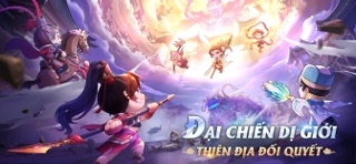
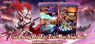


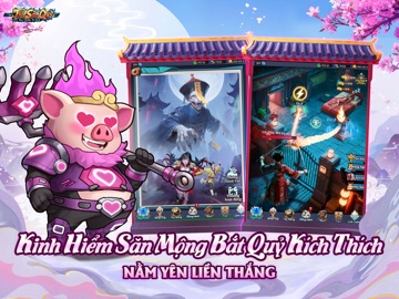
iPad screenshots


Icon palette
About this app
Thợ Săn Qủy: Đại Chiến Dị Giới mở thám hiểm Dị Giới, cảm nhận sức hút tính năng Idle! Trò chơi kết hợp yếu tố tu tiên truyền thống với chủ đề Tam Quốc và Tây Du, tái hiện một thế giới thần thoại RPG Idle hoàn toàn mới - đưa bạn trải nghiệm một vũ trụ rộng lớn giao hòa giữa nhân văn cổ phong thời Tam Quốc và những cuộc đấu pháp tu hành của thần tiên Tây Du. Trò chơi còn mở rộng xuyên suốt cổ đại hiện đại tương lai, kết hợp với trải nghiệm chơi nhẹ nhàng, linh hoạt, tỉ lệ rơi trang bị cao hơn, mở ra một hành trình thám hiểm dị giới chỉ thuộc về riêng bạn! 1. Giải phóng đôi tay, trải nghiệm tự động săn kho báu Lối chơi Idle nhẹ nhàng mới lạ, không cần thao tác nhiều vẫn nhận cực nhiều thưởng. Tự động đánh quái đánh Boss, tỷ lệ rơi kho báu tăng gấp đôi! 2. Chinh Phục Dị Giới Khiêu Chiến Đại Ma Vương BXH Cường Giả Dị Giới chính thức ra mắt, vô số Thợ Săn Ma hội tụ, tranh giành danh hiệu k…
App details
What you can learn from Thợ Săn Quỷ: Đại Chiến Dị Giới
Every shipping app on the App Store has gone through the same decisions you're working through right now: which screenshot goes first, what caption sits over it, which device frame to show, what color the background should be. The 14 screenshots above are Thợ Săn Quỷ: Đại Chiến Dị Giới's answers to those questions — they're public, they're real, and they made it through Apple's review.
What the numbers say: Thợ Săn Quỷ: Đại Chiến Dị Giới runs a mixed light-and-dark set where the background shifts from screenshot to screenshot (first shot #1C0404) — each image has to stand on its own, so the captions carry more of the story. The accent colour we picked up, #243454, is the one to reuse for badges, arrows and highlighted words if you borrow this look. Hit Use this style to open the editor with these exact colours and drop your own screenshot in.
Notice the first screenshot in particular. It's the one users see in search results and on the product page, and it's where most apps spend their best caption and tightest design. Look at the proportion of background to phone, where the text sits, what one thing the image is trying to communicate.
Want to see how other Games apps approach the same problem? Browse more Games apps in the showcase.
Take what works into your own screenshots
Open LaunchShots and design your App Store & Google Play screenshots — pick a device frame, drop captions, ship in minutes. Free, in your browser.
Open the screenshot editor →Apps with a similar look
Closest background + accent colours among the listings we've analysed — useful when you want to see the same palette handled by a different team.