Chart position — tracked daily by LaunchShots
Screenshot style breakdown
Sampled from 6 of 배고파용 키우기 : 방치형 RPG's App Store screenshots — background, accent and theme, measured by LaunchShots (not something Apple publishes).
#6CBCEC bg
#5FA5CF
#FC5C04 accent
#111111 text
Screenshots

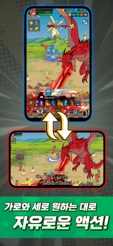


iPad screenshots


Icon palette
About this app
◎세상에서 가장 맛있는 성장을 시작하세요! 초보 요리사 드래곤의 위대한 여정! 신선한 재료를 모아 전설의 레시피를 완성하고, 당신만의 특별한 드래곤 셰프를 성장시켜 보세요. 바쁜 일상 속, 눈과 귀가 즐거워지는 맛있는 모험이 지금 시작됩니다. ◎눈을 떼지 못할 고속 성장! 배고파용 : 방치형RPG 쉴 틈 없이 강해지는 짜릿한 손맛! 화려한 스킬로 던전을 요리하세요. 오프라인 중에도 드래곤의 요리는 멈추지 않습니다. 지금 접속해서 최강의 셰프 드래곤으로 각성시키세요! 당신의 드래곤은 어디까지 강해질 수 있을까요? ◎전설의 레시피를 찾아서: 드래곤 요리사의 탄생" 몬스터가 득실거리는 험난한 필드, 그곳에 최고의 요리를 꿈꾸는 드래곤이 나타났다! 다양한 필드를 누비며 재료를 수집하고 강력한 보스들을 제압하세요. 요리하면 할수록 강해지는 드래곤의 특별한 모험에 당신을 초대합니다.
App details
What you can learn from 배고파용 키우기 : 방치형 RPG
Every shipping app on the App Store has gone through the same decisions you're working through right now: which screenshot goes first, what caption sits over it, which device frame to show, what color the background should be. The 12 screenshots above are 배고파용 키우기 : 방치형 RPG's answers to those questions — they're public, they're real, and they made it through Apple's review.
What the numbers say: 배고파용 키우기 : 방치형 RPG runs a mixed light-and-dark set where the background shifts from screenshot to screenshot (first shot #6CBCEC) — each image has to stand on its own, so the captions carry more of the story. The accent colour we picked up, #FC5C04, is the one to reuse for badges, arrows and highlighted words if you borrow this look. Hit Use this style to open the editor with these exact colours and drop your own screenshot in.
Notice the first screenshot in particular. It's the one users see in search results and on the product page, and it's where most apps spend their best caption and tightest design. Look at the proportion of background to phone, where the text sits, what one thing the image is trying to communicate.
Want to see how other Games apps approach the same problem? Browse more Games apps in the showcase.
Take what works into your own screenshots
Open LaunchShots and design your App Store & Google Play screenshots — pick a device frame, drop captions, ship in minutes. Free, in your browser.
Open the screenshot editor →Apps with a similar look
Closest background + accent colours among the listings we've analysed — useful when you want to see the same palette handled by a different team.