Screenshot changes — detected by LaunchShots
Screenshot style breakdown
Sampled from 6 of Toyzie AI: Toy Value Scanner's App Store screenshots — background, accent and theme, measured by LaunchShots (not something Apple publishes).
#040404 bg
#272727
#FCCC04 accent
#FFFFFF text
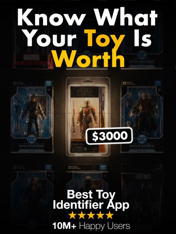
- #1Best To Identifier Kop
- #2Toys $34210 Collections Total value Top 10 Most Valuable Toys
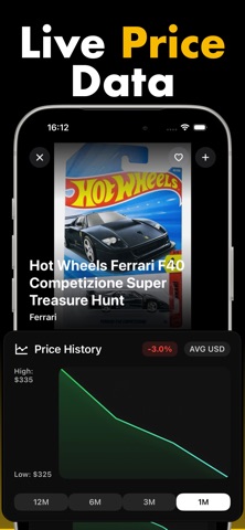
- #3High: Low: $325
- #4(Estimated) COA AFA LAS Based on leading 83 toy grading standards
- #5WRESTLING JA.. LEGENDS SENT... 94.99 USD 99.74 USD
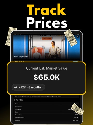
- #6Current Est. Market Value => +12% (6 months) Low High IE
Captions read from the screenshots (OCR, may contain small errors): 6 headlines, 7.8 words on average (longest 11).
Screenshots




iPad screenshots


Icon palette
About this app
The smartest way to scan, value, and track your toy collection. Toyzie AI is the AI-powered scanner built for diecast hunters, Hot Wheels collectors, and toy enthusiasts who want to know exactly what they have — and what it's worth. Snap any Hot Wheels car, action figure, Funko, minifig, or TCG card and Toyzie reveals brand, year, series, rarity, and live market value in seconds. Key Features * Scan & Identify Point your camera at any collectible and instantly get its name, brand, series, casting, and release year. Built for diecast first — Toyzie recognizes Mainline, Premium, Boulevard, Car Culture, Pop Culture, and RLC releases, and flags Treasure Hunts (TH) and Super Treasure Hunts (STH) the moment you scan them. * AI Grading Get an estimated condition score powered by AI. The system analyzes packaging, surface quality, edges, alignment, and overall structure to provide a gradin…
App details
What you can learn from Toyzie AI: Toy Value Scanner
Every shipping app on the App Store has gone through the same decisions you're working through right now: which screenshot goes first, what caption sits over it, which device frame to show, what color the background should be. The 11 screenshots above are Toyzie AI: Toy Value Scanner's answers to those questions — they're public, they're real, and they made it through Apple's review.
What the numbers say: Toyzie AI: Toy Value Scanner runs a dark set with one background colour (#040404) carried across every screenshot — the listing reads as a single poster when the shots sit side by side in search results. The accent colour we picked up, #FCCC04, is the one to reuse for badges, arrows and highlighted words if you borrow this look. Hit Use this style to open the editor with these exact colours and drop your own screenshot in.
Notice the first screenshot in particular. It's the one users see in search results and on the product page, and it's where most apps spend their best caption and tightest design. Look at the proportion of background to phone, where the text sits, what one thing the image is trying to communicate.
Want to see how other Reference apps approach the same problem? Browse more Reference apps in the showcase.
Take what works into your own screenshots
Open LaunchShots and design your App Store & Google Play screenshots — pick a device frame, drop captions, ship in minutes. Free, in your browser.
Open the screenshot editor →Apps with a similar look
Closest background + accent colours among the listings we've analysed — useful when you want to see the same palette handled by a different team.