Chart position — tracked daily by LaunchShots
Screenshot changes — detected by LaunchShots
Screenshot style breakdown
Sampled from 6 of Haunted Room: Ngôi Nhà Hắc Ám's App Store screenshots — background, accent and theme, measured by LaunchShots (not something Apple publishes).
#04344C bg
#275065
#246C8C accent
#FFFFFF text
Screenshots
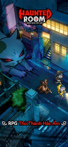
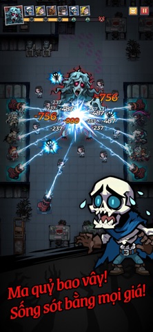

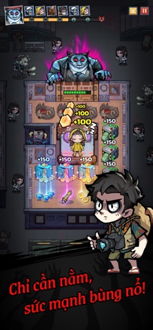


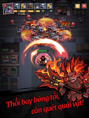
iPad screenshots



Icon palette
About this app
Quyết định phê duyệt nội dung kịch bản trò chơi điện tử G1 trên mạng số: 141/QĐ-PTTH&TTĐT cấp ngày 25/03/2026 Link giấy phép: https://giayphep.abei.gov.vn/g1/132045 [Phần Thưởng Đặc Biệt] 500 lượt rút, Trang Phục Bộ Xương, Anh Hùng Cam ngẫu nhiên và Trang Trí giới hạn! Khi đô thị quen thuộc bỗng biến thành bãi săn của Ác Linh... “Cộc cộc cộc”, tiếng gõ cửa bí ẩn vang lên... “Suỵt, khẽ thôi, không được mở cửa.” Tất cả Ác Linh trong truyền thuyết đang phá vỡ chiều không gian, sẵn sàng tông sập cửa phòng bạn bất cứ lúc nào. Việc bạn cần làm là khóa chặt cửa, cùng dàn Anh Hùng khai hỏa trận chiến bảo vệ [Cánh Cửa] cực kỳ phấn khích nhưng cũng đầy kịch tính! Từ trường học, bệnh viện, khách sạn đến phố xá hay văn phòng – mỗi bối cảnh đời thường đều trở thành một màn chơi Thủ Thành đầy kích thích. Tận hưởng niềm vui kép về cả thị giác lẫn thao tác chỉ với 5 phút mỗi trận! [5 ĐIỂM ĐẶC SẮC…
App details
What you can learn from Haunted Room: Ngôi Nhà Hắc Ám
Every shipping app on the App Store has gone through the same decisions you're working through right now: which screenshot goes first, what caption sits over it, which device frame to show, what color the background should be. The 12 screenshots above are Haunted Room: Ngôi Nhà Hắc Ám's answers to those questions — they're public, they're real, and they made it through Apple's review.
What the numbers say: Haunted Room: Ngôi Nhà Hắc Ám runs a dark set where the background shifts from screenshot to screenshot (first shot #04344C) — each image has to stand on its own, so the captions carry more of the story. The accent colour we picked up, #246C8C, is the one to reuse for badges, arrows and highlighted words if you borrow this look. Hit Use this style to open the editor with these exact colours and drop your own screenshot in.
Notice the first screenshot in particular. It's the one users see in search results and on the product page, and it's where most apps spend their best caption and tightest design. Look at the proportion of background to phone, where the text sits, what one thing the image is trying to communicate.
Want to see how other Games apps approach the same problem? Browse more Games apps in the showcase.
Take what works into your own screenshots
Open LaunchShots and design your App Store & Google Play screenshots — pick a device frame, drop captions, ship in minutes. Free, in your browser.
Open the screenshot editor →Apps with a similar look
Closest background + accent colours among the listings we've analysed — useful when you want to see the same palette handled by a different team.