Chart position — tracked daily by LaunchShots
Screenshot style breakdown
Sampled from 5 of 云·终末地's App Store screenshots — background, accent and theme, measured by LaunchShots (not something Apple publishes).
#F4F4FC bg
#D6D6DD
#3C446C accent
#111111 text
Screenshots


iPad screenshots

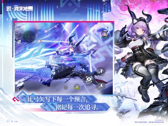
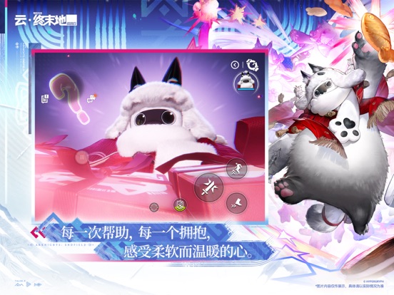


Icon palette
About this app
《云・终末地》是《明日方舟:终末地》的官方云游戏版本,管理员仅需下载超小包体就可以尽情探索塔卫二,并享受高画质、高帧率与低电耗的畅快游戏体验。 《明日方舟:终末地》是一款由鹰角网络自研的3D即时策略RPG,玩家将作为终末地工业的管理员,逐步探索塔卫二,揭开属于这颗星球的秘密,保卫和拓展人类文明的边疆。 “‘零号委托’现已发出。请您确认,是否接受委托,以管理员的身份加入终末地工业,利用集成工业科技技术,和干员们一道,开拓人类新的家园?” 欢迎来到塔卫二,这是一个美丽却遍布危机的世界。这个世界的访客,曾经的开拓者们,克服了战争与灾祸,在一百五十余年的拼搏下站稳了脚跟,为人类构筑了新的根基——文明环带。但这个世界的大部分土地仍未被刻上文明的印记,延展到天际的荒野与无人区依然等待着开拓与探索,过去的、崭新的威胁也如影随形。 开拓与探索,延续与发展,是文明轨迹永恒的主题,也是构成文明的生命最终的索求。 您将成为终末地工业的管理员,率领您的干员们,保卫、拓展人类的边疆。您的源石发动机将在荒野上轰鸣,您的生产设…
App details
What you can learn from 云·终末地
Every shipping app on the App Store has gone through the same decisions you're working through right now: which screenshot goes first, what caption sits over it, which device frame to show, what color the background should be. The 10 screenshots above are 云·终末地's answers to those questions — they're public, they're real, and they made it through Apple's review.
What the numbers say: 云·终末地 runs a light set with one background colour (#F4F4FC) carried across every screenshot — the listing reads as a single poster when the shots sit side by side in search results. The accent colour we picked up, #3C446C, is the one to reuse for badges, arrows and highlighted words if you borrow this look. Hit Use this style to open the editor with these exact colours and drop your own screenshot in.
Notice the first screenshot in particular. It's the one users see in search results and on the product page, and it's where most apps spend their best caption and tightest design. Look at the proportion of background to phone, where the text sits, what one thing the image is trying to communicate.
Want to see how other Games apps approach the same problem? Browse more Games apps in the showcase.
Take what works into your own screenshots
Open LaunchShots and design your App Store & Google Play screenshots — pick a device frame, drop captions, ship in minutes. Free, in your browser.
Open the screenshot editor →Apps with a similar look
Closest background + accent colours among the listings we've analysed — useful when you want to see the same palette handled by a different team.