Chart position — tracked daily by LaunchShots
Screenshot style breakdown
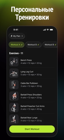
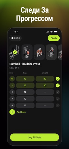
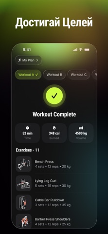
Sampled from 4 of Gymtone - План тренировок's App Store screenshots — background, accent and theme, measured by LaunchShots (not something Apple publishes).
#040404 bg
#272727
#BCEC34 accent
#FFFFFF text
Screenshots

Icon palette
About this app
Мы создали Gymtone, чтобы помочь тебе построить тело, которое ты хочешь, — никаких запутанных программ и догадок у стойки, только понятные тренировки с гидом, которые подходят именно твоему уровню и целям. Наша миссия — стать личным тренером в твоём кармане: не просто списком упражнений, а настоящим спутником, который ведёт тебя через каждое повторение, каждый подход и каждый шаг твоего прогресса. Нажми Старт, повторяй за нами — и мы приведём тебя к твоим фитнес-целям! Функции, которые мы создали для тебя: – Библиотека упражнений с анимациями Смотри, как именно выполняется каждое движение, благодаря понятным анимированным демонстрациям — правильная техника каждый раз. – Персональные программы тренировок Тренируйся умнее с планами, построенными под твою цель, опыт и доступное оборудование. – Напоминания о тренировках Мы напомним, когда пора тренироваться, чтобы ты не пропустил ни о…
App details
What you can learn from Gymtone - План тренировок
Every shipping app on the App Store has gone through the same decisions you're working through right now: which screenshot goes first, what caption sits over it, which device frame to show, what color the background should be. The 4 screenshots above are Gymtone - План тренировок's answers to those questions — they're public, they're real, and they made it through Apple's review.
What the numbers say: Gymtone - План тренировок runs a dark set with one background colour (#040404) carried across every screenshot — the listing reads as a single poster when the shots sit side by side in search results. The accent colour we picked up, #BCEC34, is the one to reuse for badges, arrows and highlighted words if you borrow this look. Hit Use this style to open the editor with these exact colours and drop your own screenshot in.
Notice the first screenshot in particular. It's the one users see in search results and on the product page, and it's where most apps spend their best caption and tightest design. Look at the proportion of background to phone, where the text sits, what one thing the image is trying to communicate.
Want to see how other Health & Fitness apps approach the same problem? Browse more Health & Fitness apps in the showcase.
Take what works into your own screenshots
Open LaunchShots and design your App Store & Google Play screenshots — pick a device frame, drop captions, ship in minutes. Free, in your browser.
Open the screenshot editor →Apps with a similar look
Closest background + accent colours among the listings we've analysed — useful when you want to see the same palette handled by a different team.