Screenshot style breakdown
Sampled from 6 of EduBase - KPSS's App Store screenshots — background, accent and theme, measured by LaunchShots (not something Apple publishes).
#ECECF4 bg
#CFCFD6
#041C54 accent
#111111 text
Reading the caption text from the screenshots in your browser…
Screenshots


Icon palette
About this app
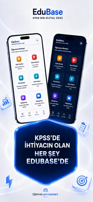
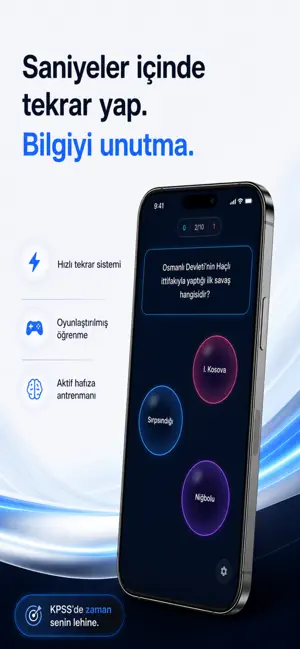
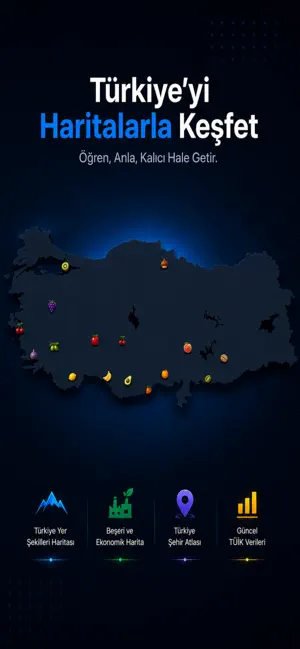
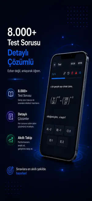
EduBase, Türkiye’nin KPSS alanındaki en kapsamlı dijital eğitim platformu olarak tüm ihtiyacınızı tek bir uygulamada topluyor. Neden EduBase? Derece Yapan Tecrübe: KPSS’den 92+ puan almış 10 kişilik uzman ekip tarafından, sınavın gerçek dinamiklerine göre hazırlandı. Soru Arşivi: 25.000+ özgün soru ve 40.000+ aktif içerikle eksiksiz hazırlık. Görsel Hafıza Desteği: Akıllı kartlar ve sinematik görsel hafıza teknikleriyle bilgileri unutmaya son verin. Adım Adım Matematik: Matematik temeli olmayanlar için özel olarak hazırlanan 3.000 soruluk başlangıç modülü. Etkileşimli Öğrenme: Coğrafyayı haritalarla, karmaşık bilgileri eşleştirme modülleriyle kalıcı öğrenin. Sadece soru çözmeyin; planlayın, ölçün ve kazanın! Hızlı Tekrar: Oyunlaştırma yöntemi ile saniyeler içinde tüm konuları tarayın. Branş Denemeleri: Gerçek sınav provasıyla seviyenizi anlık görün. Rehberlik: Çalışma sürecini…
App details
What you can learn from EduBase - KPSS
Every shipping app on the App Store has gone through the same decisions you're working through right now: which screenshot goes first, what caption sits over it, which device frame to show, what color the background should be. The 6 screenshots above are EduBase - KPSS's answers to those questions — they're public, they're real, and they made it through Apple's review.
What the numbers say: EduBase - KPSS runs a mixed light-and-dark set where the background shifts from screenshot to screenshot (first shot #ECECF4) — each image has to stand on its own, so the captions carry more of the story. The accent colour we picked up, #041C54, is the one to reuse for badges, arrows and highlighted words if you borrow this look. Hit Use this style to open the editor with these exact colours and drop your own screenshot in.
Notice the first screenshot in particular. It's the one users see in search results and on the product page, and it's where most apps spend their best caption and tightest design. Look at the proportion of background to phone, where the text sits, what one thing the image is trying to communicate.
Want to see how other Education apps approach the same problem? Browse more Education apps in the showcase.
Take what works into your own screenshots
Open LaunchShots and design your App Store & Google Play screenshots — pick a device frame, drop captions, ship in minutes. Free, in your browser.
Open the screenshot editor →Apps with a similar look
Closest background + accent colours among the listings we've analysed — useful when you want to see the same palette handled by a different team.