Screenshot changes — detected by LaunchShots
Screenshot style breakdown
Sampled from 5 of Huyền Thoại Hương Cảng's App Store screenshots — background, accent and theme, measured by LaunchShots (not something Apple publishes).
#ECECEC bg
#CFCFCF
#7C0404 accent
#111111 text
Screenshots

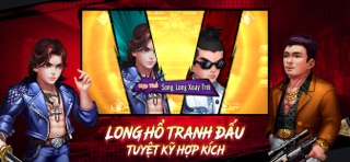
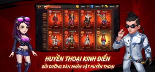


iPad screenshots

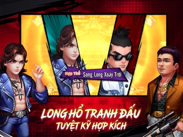
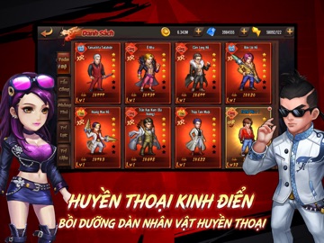


Icon palette
About this app
Huyền Thoại Hương Cảng là game mobile RPG thẻ tướng được cấp phép chính thức từ IP truyện tranh Người Trong Giang Hồ. Tái hiện trọn vẹn cốt truyện nguyên tác, mở ra chương mới đang chờ bạn viết tiếp! [Đấu đối kháng màn hình ngang cực đã] Chuỗi combo liên hoàn, truy kích ra đòn mạnh mẽ mang đến trải nghiệm chiến đấu đã tay. Kết hợp hiệu ứng kỹ năng mãn nhãn, đưa bạn sống lại cảm giác “đại chiến đường phố” kinh điển của game thùng ngày xưa. [Dàn nhân vật kinh điển hội tụ] Trần Hạo Nam, Sơn Kê, Đại Thiên Nhị, Bao Bì, Đại Đầu, Đại Phi, Thập Tam Muội, Tưởng Thiên Dưỡng cùng nhiều nhân vật máu mặt trong nguyên tác sẽ đồng loạt xuất hiện! [Cốt truyện giang hồ đầy kịch tính] Tuyến truyện chính tái hiện trọn vẹn những phân cảnh kinh điển trong truyện tranh. Bạn sẽ trực tiếp trải qua hành trình nhiệt huyết, từng bước vươn lên trở thành người đứng đầu bang hội. [Tranh bá bang phái, trọng nghĩa…
App details
What you can learn from Huyền Thoại Hương Cảng
Every shipping app on the App Store has gone through the same decisions you're working through right now: which screenshot goes first, what caption sits over it, which device frame to show, what color the background should be. The 10 screenshots above are Huyền Thoại Hương Cảng's answers to those questions — they're public, they're real, and they made it through Apple's review.
What the numbers say: Huyền Thoại Hương Cảng runs a mixed light-and-dark set where the background shifts from screenshot to screenshot (first shot #ECECEC) — each image has to stand on its own, so the captions carry more of the story. The accent colour we picked up, #7C0404, is the one to reuse for badges, arrows and highlighted words if you borrow this look. Hit Use this style to open the editor with these exact colours and drop your own screenshot in.
Notice the first screenshot in particular. It's the one users see in search results and on the product page, and it's where most apps spend their best caption and tightest design. Look at the proportion of background to phone, where the text sits, what one thing the image is trying to communicate.
Want to see how other Games apps approach the same problem? Browse more Games apps in the showcase.
Take what works into your own screenshots
Open LaunchShots and design your App Store & Google Play screenshots — pick a device frame, drop captions, ship in minutes. Free, in your browser.
Open the screenshot editor →Apps with a similar look
Closest background + accent colours among the listings we've analysed — useful when you want to see the same palette handled by a different team.